Etsy - Add a Feature
An exploration of meeting user needs with an additional feature.
Overview
Project Type
Independent
My Roles
UX researcher
UX tester
UX/UI designer
Tools
Figma
Miro
Length
80 hours
Background
Founded in 2005 in Brooklyn, NY, Etsy was created for people to list and sell handmade merchandise. Its key message is centered around connecting people to the makers, calling itself a global marketplace for unique and creative goods. Home to a universe of special, extraordinary items, from unique handcrafted pieces to vintage treasures.
Problem
Etsy users are researchers at heart. Many users come to Etsy with specific needs/items in mind and often find they have to move to/use a laptop to manage the multiple tabs they have open when deciding which item best meets their needs.
Goal
My goal was to find a way for Etsy users to be able to more easily research and compare multiple items they are interested in purchasing when on a mobile device.
Solution
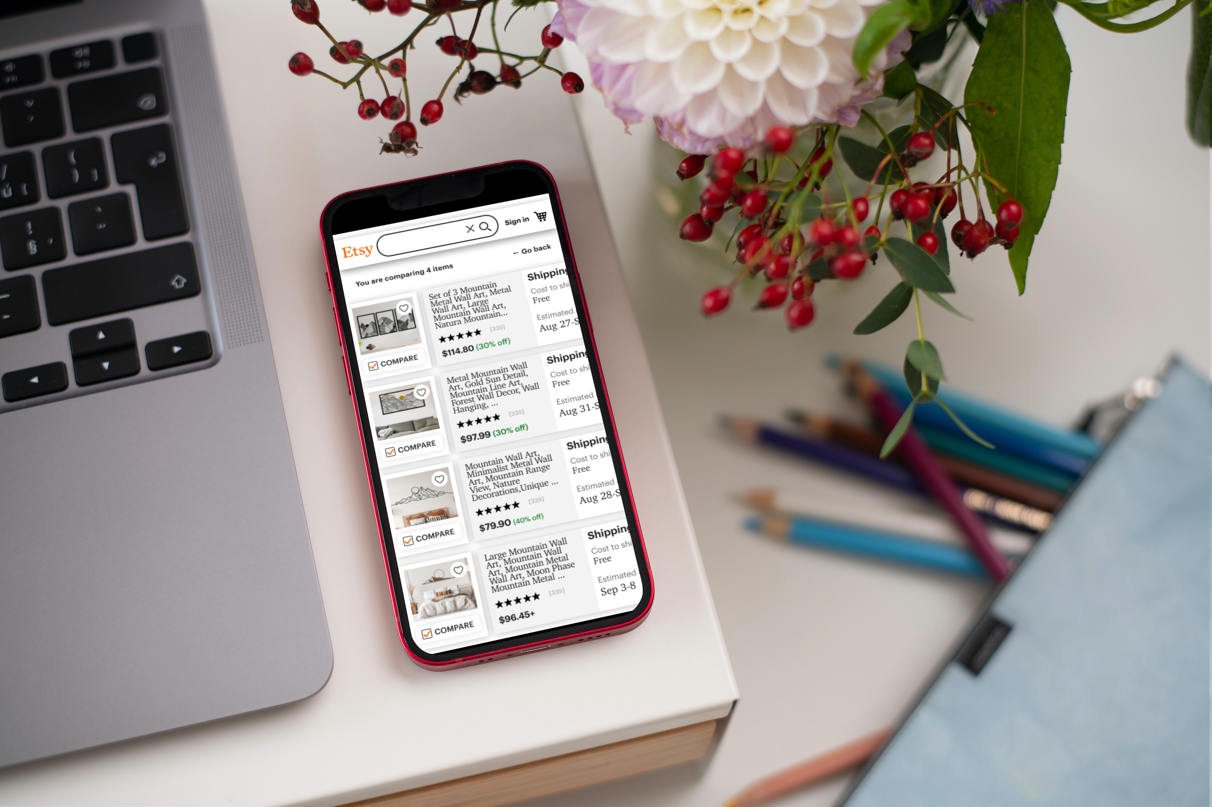
The solution was to create a comparison tool that allows users to quickly compare key aspects of products on mobile.
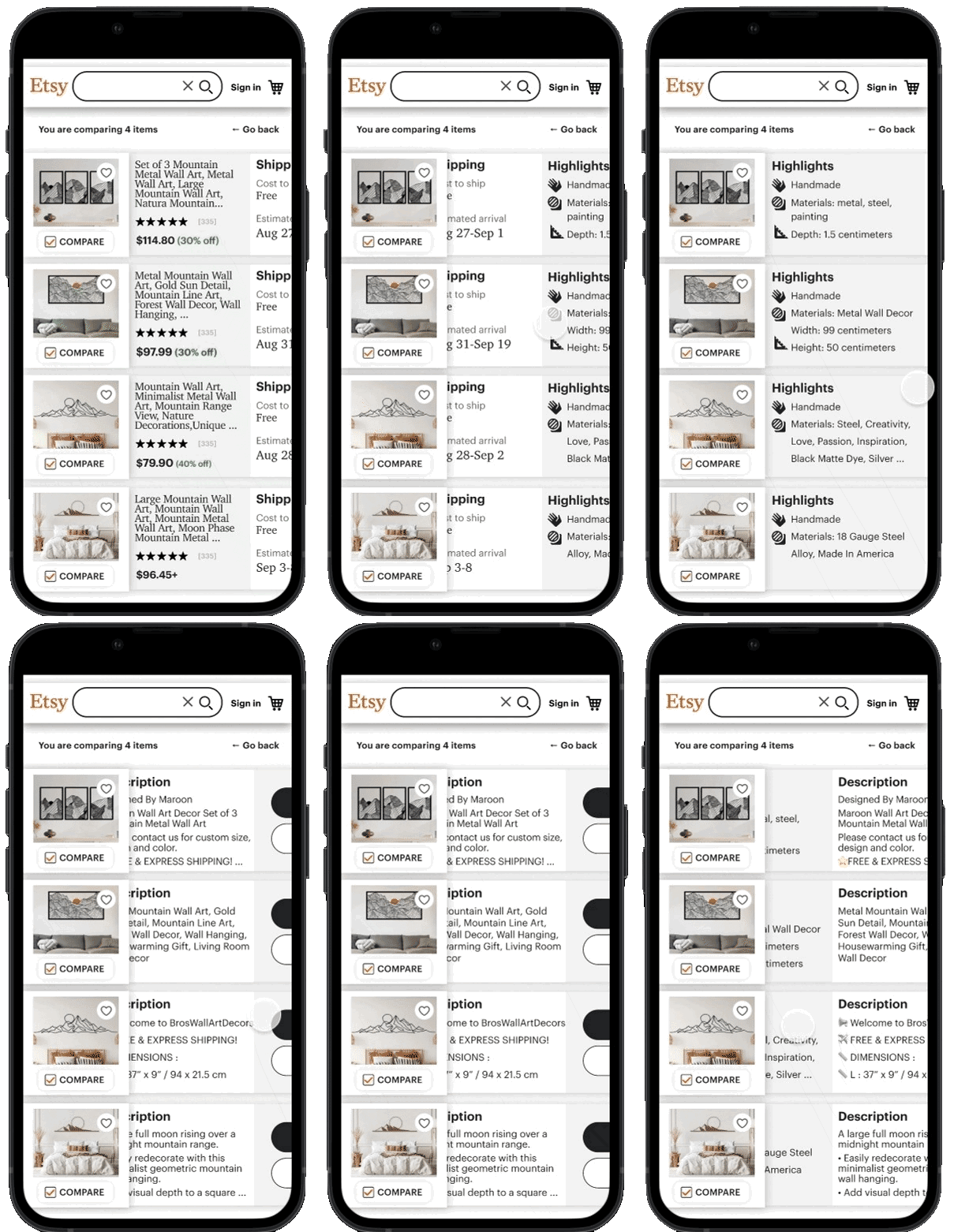
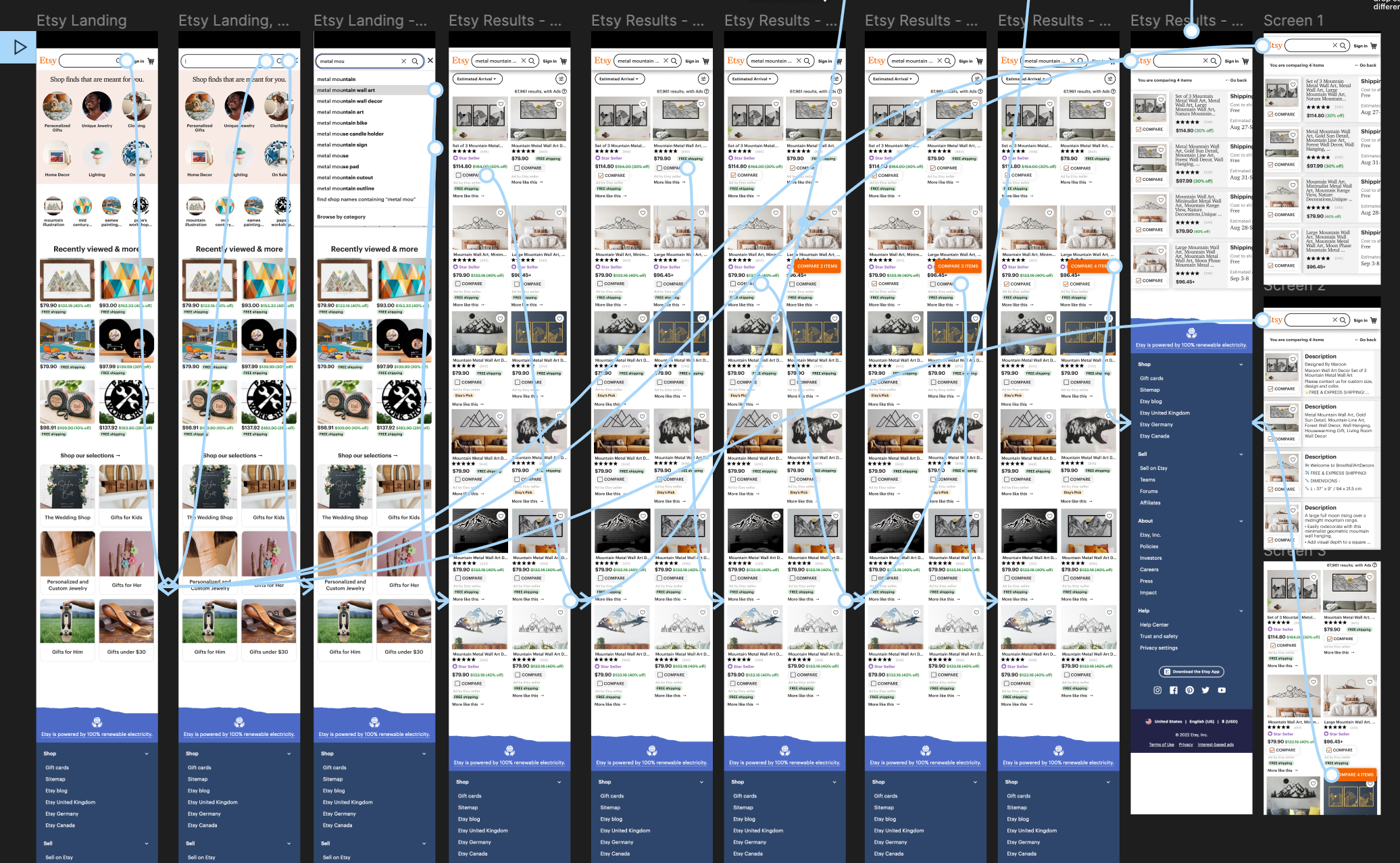
Prototype of the Etsy comparison tool in action
Process
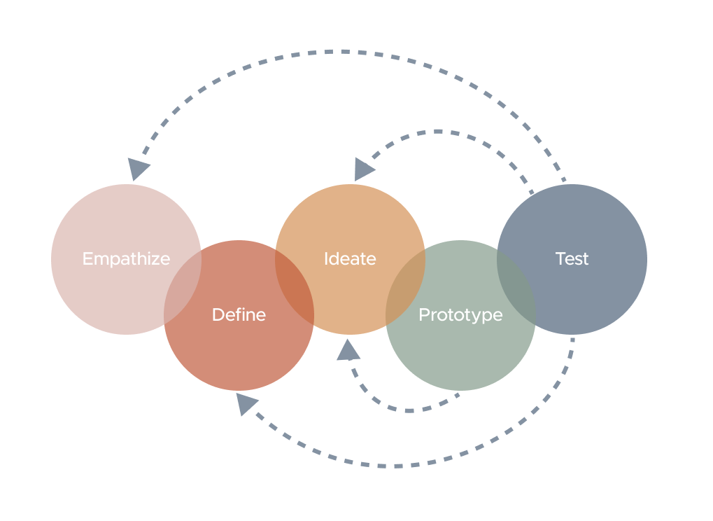
I take a user-centered design thinking approach when tackling a project, this approach includes the processes below. My goal is to empathize with the users to ensure that my designs are intuitive and accessible.
User Research
My initial goal in discovery was to learn more about how people are using Etsy. I wanted to gather a better understanding of whether users are coming to Etsy to browse or they have specific items in mind, how they might be navigating results, and how they decided which items/sellers best meet their needs. I started by looking at the following information:
- Learn more about the retail space that Etsy is in and get an basic understanding of strengths, weaknesses, opportunities, and threats.
- Who the users are; their motivations when choosing to shop at Etsy over other online stores challenges/concerns are when looking to purchase items on Etsy.
- Understand what users need to know when when looking looking at products and sellers on Etsy and learn what information helps them decide when product is the one they want.
- Identify a problem I can solve by adding a feature to the Etsy mobile site.
One-On-One Interviews
I interviewed 5 people who have used Etsy at least a couple of times in the last year. Aged between 27 and 48. My objective was to understand what motivates users to shop at etsy and learn the wins and challenges of finding what they want on the platform.

Julian, 30
Graphic Designer | Brooklyn, NY
Shops at etsy.com every few months, will browse every week or two
Gloria, 35
Environmental researcher | Colorado
Buys on etsy a couple of times a year
Stella, 27
Student + PT worker | LA
Buys from etsy a handful of times a year

Rana, 35
Student + PT worker | Florida
Buys on etsy about once a month

Amelia, 48
HR for tech company | Reading, UK
Buys from Etsy every 2-3 months
Etsy buyers do their research - a tool would help this process
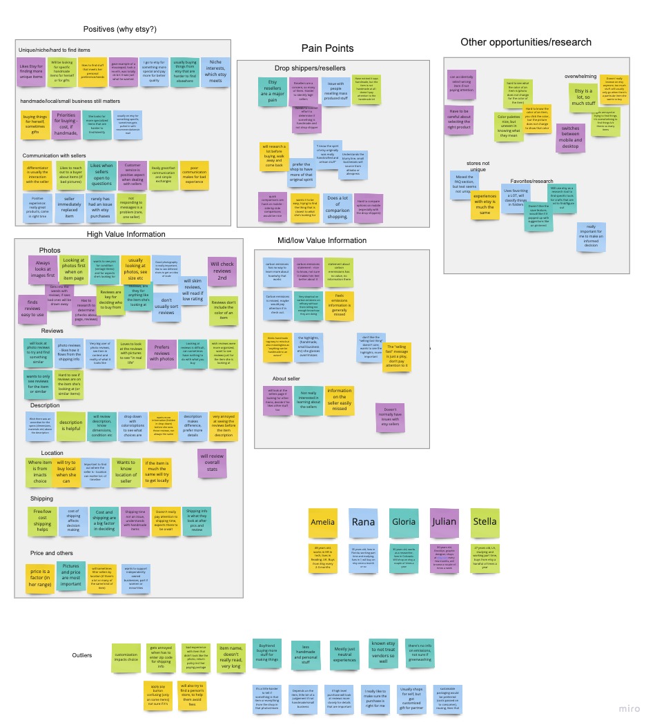
I opted to create an empathy map to help me synthesize my learnings. This process really helped me extract the primary challenges and needs of users when shopping on Etsy. It quickly became clear that Etsy shoppers are researchers at heart, they love to fully understand their options before decided which product to buy.
Etsy has a lot of wins for users, from the handmade and niche items, shopping from small business, handmade, and the human connection/positive communication with sellers. Resellers/drop shippers are a challenge for all users and is part of the reason users find themselves on a computer to better compare products.
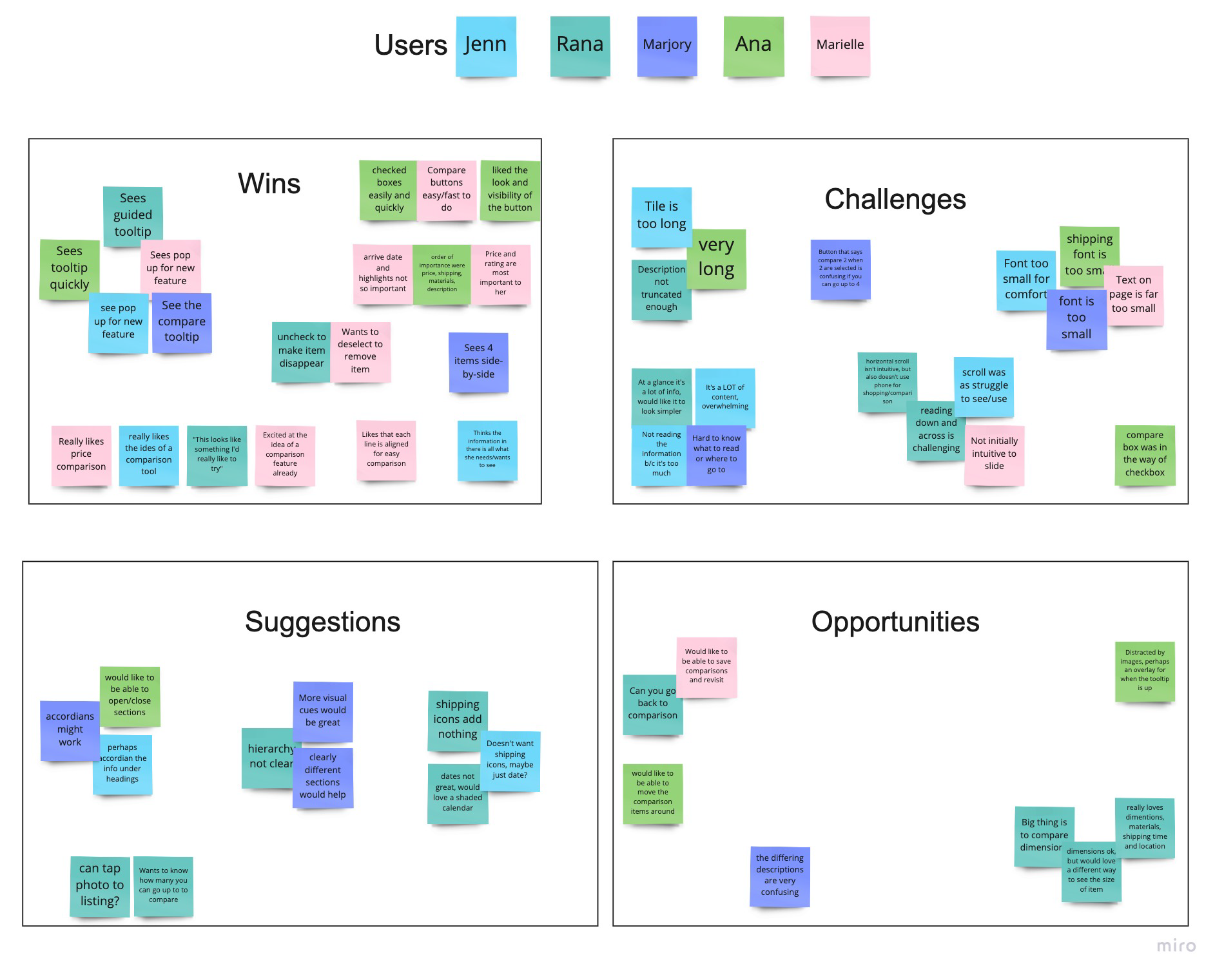
Affinity map created from user interviews, it highlights positives, pain points, opportunities, and high/medium and low value information on products when shopping on Etsy
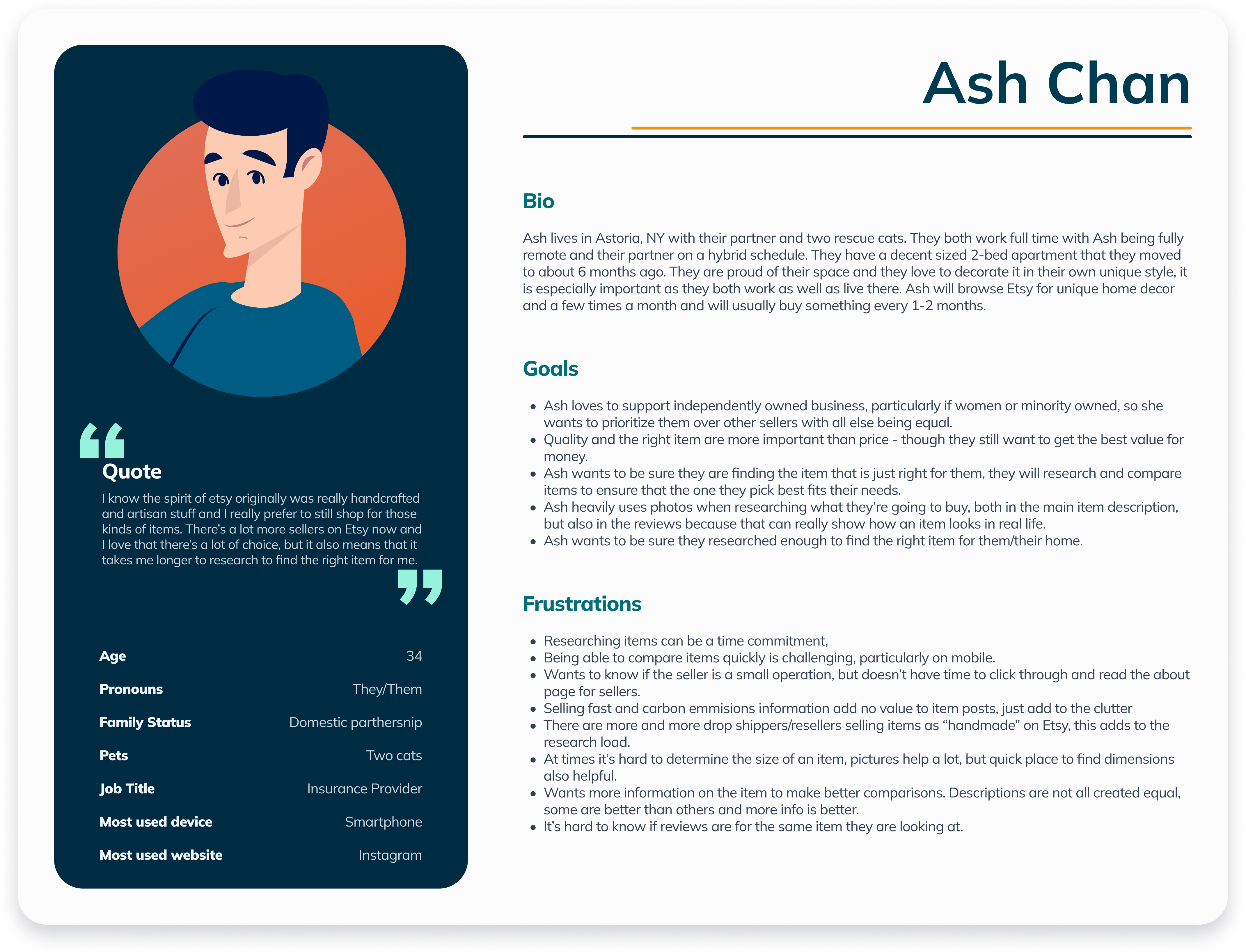
Meet Ash - Etsy persona
Based on user the interviews, I created a persona, Ash Chan. Ash loves to support independently owned businesses and would prefer to prioritize them over big box sellers. Quality is more important than price, but that means researching the products to ensure their expectations are being met, this research is time consuming and often cannot be done well on mobile.
Product requirements
I decided that I needed to focus on creating a feature for mobile for two reasons: firstly, users from my interviews were switching from mobile to desktop to continue shopping, increasing the chance of lost business for Etsy. Secondly, in 2021 67% of users were accessing etsy via mobile, this trend is expected to increase over time.
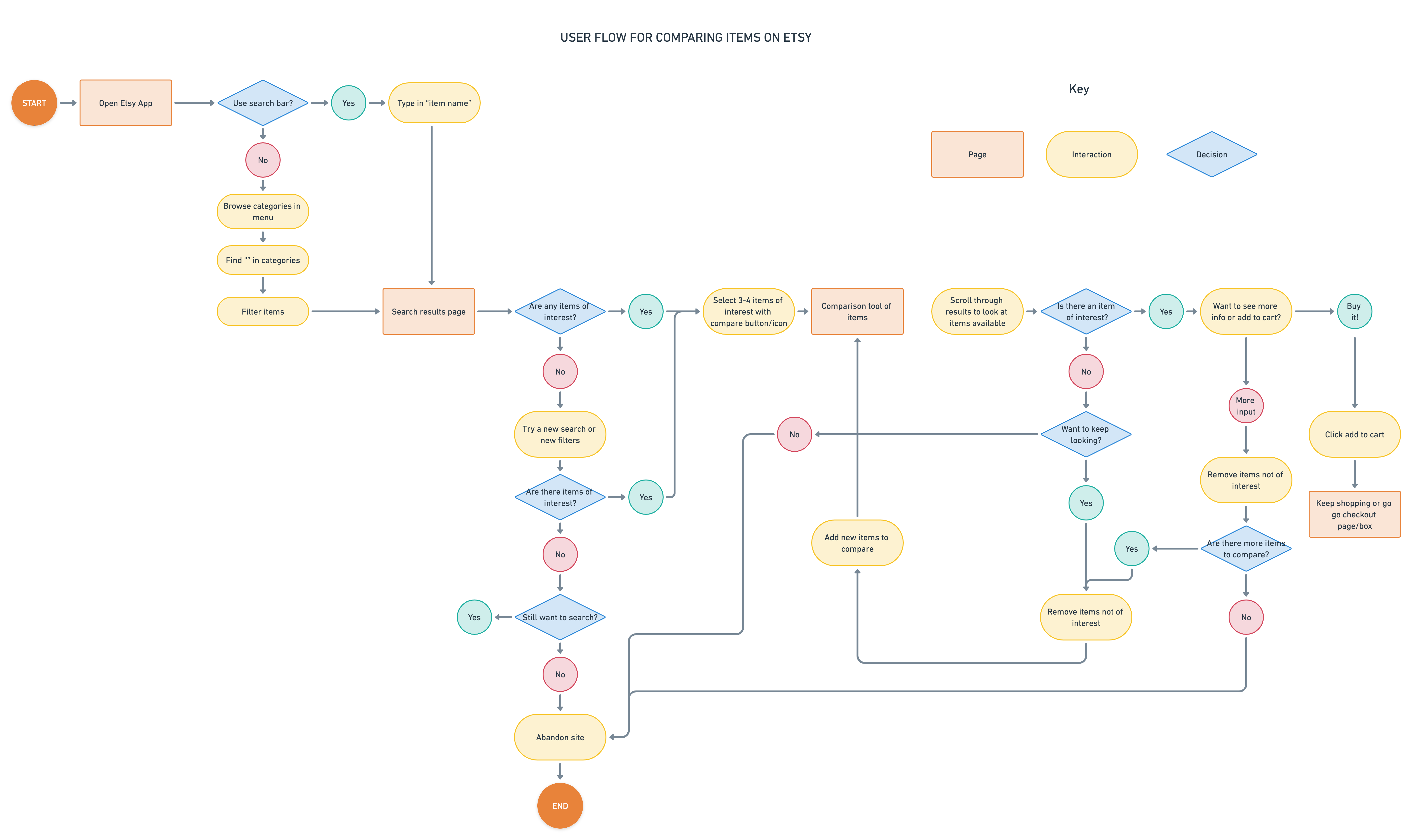
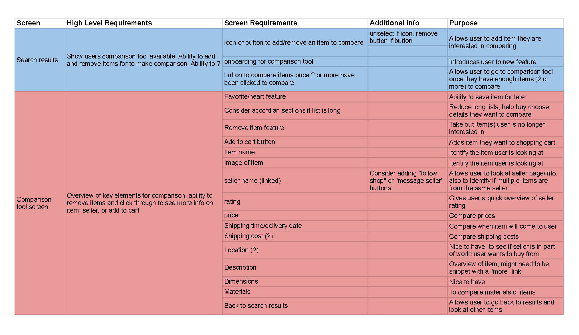
Using insights gathered from the task and user flows. I then created a product requirements matrix diagram to identify which pages and screen requirements were needed for the MVP.
Competitive review
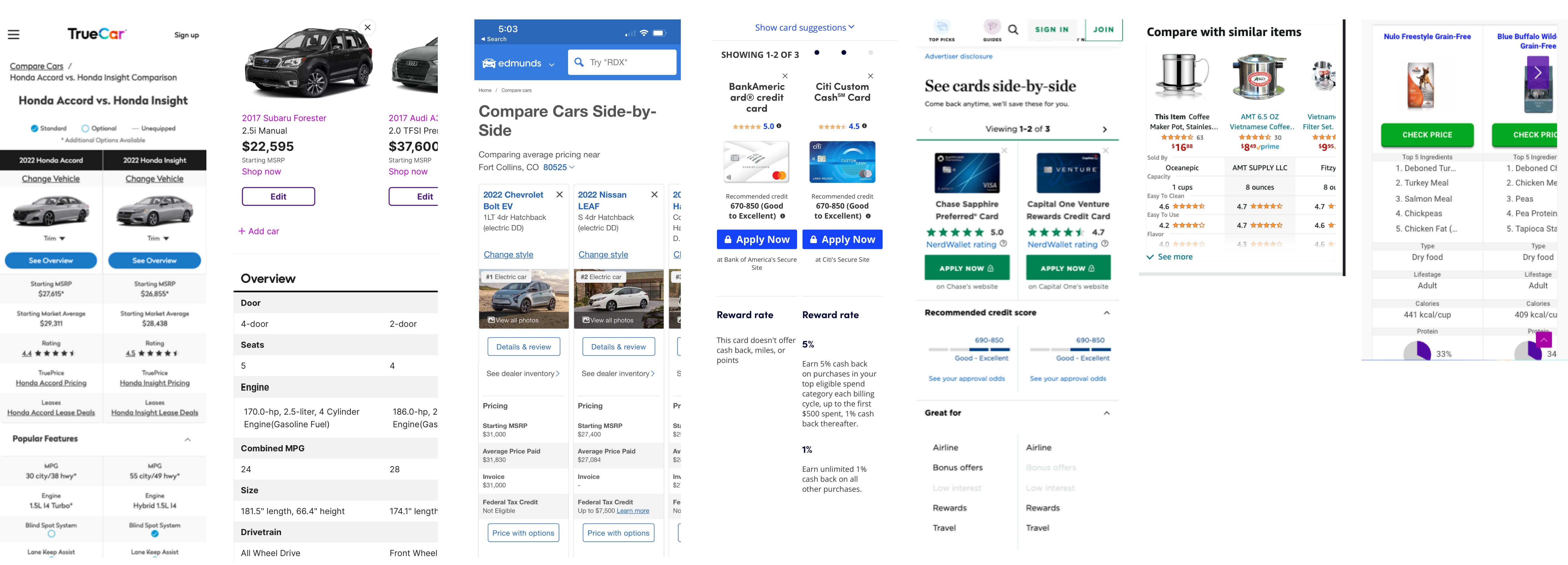
Now that I understood product requirements I decided to look at how other companies were managing comparison tools on mobile so I could identify design patterns that I might use for this new feature. I looked at car comparison, credit card comparison, shopping comparison, and pet food comparison tools.
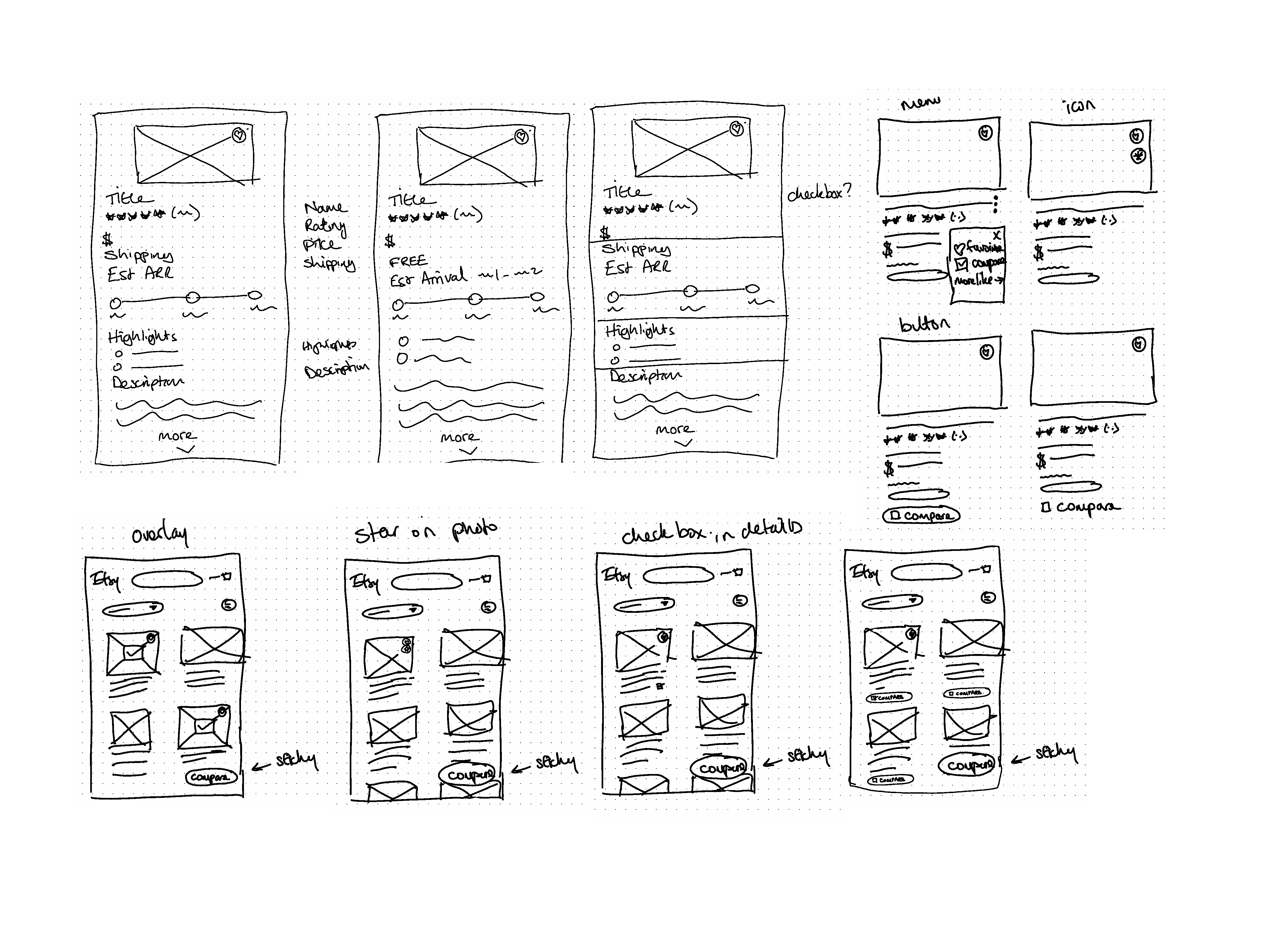
Sketching out ideas
The comparison tools I was able to find in this research used a carousel-type design with the image up the top, and details following in a column below it, users could then scroll across to see more other products/items they had selected to compare. Using this design pattern, sketched out some concepts using Etsy's style system and the product requirements to quickly generate ideas.
Prototype Testing
Using sketches and taking into account for consistency, I adopted the current for my visual elements. I then created a prototype to set up a flow to test the comparison tool. My goal was to:
- learn if the flow was effortless and intuitive
- ensure that users saw the information they felt they needed to chose a product
- identify any points of friction/places for improvement
- learn any additional expectations from users, both within the flow and beyond
Interviewed 5 people aged 26-47 for 10-15 mins via zoom, using screenshare to observe their interaction with the prototype.
Revision planning
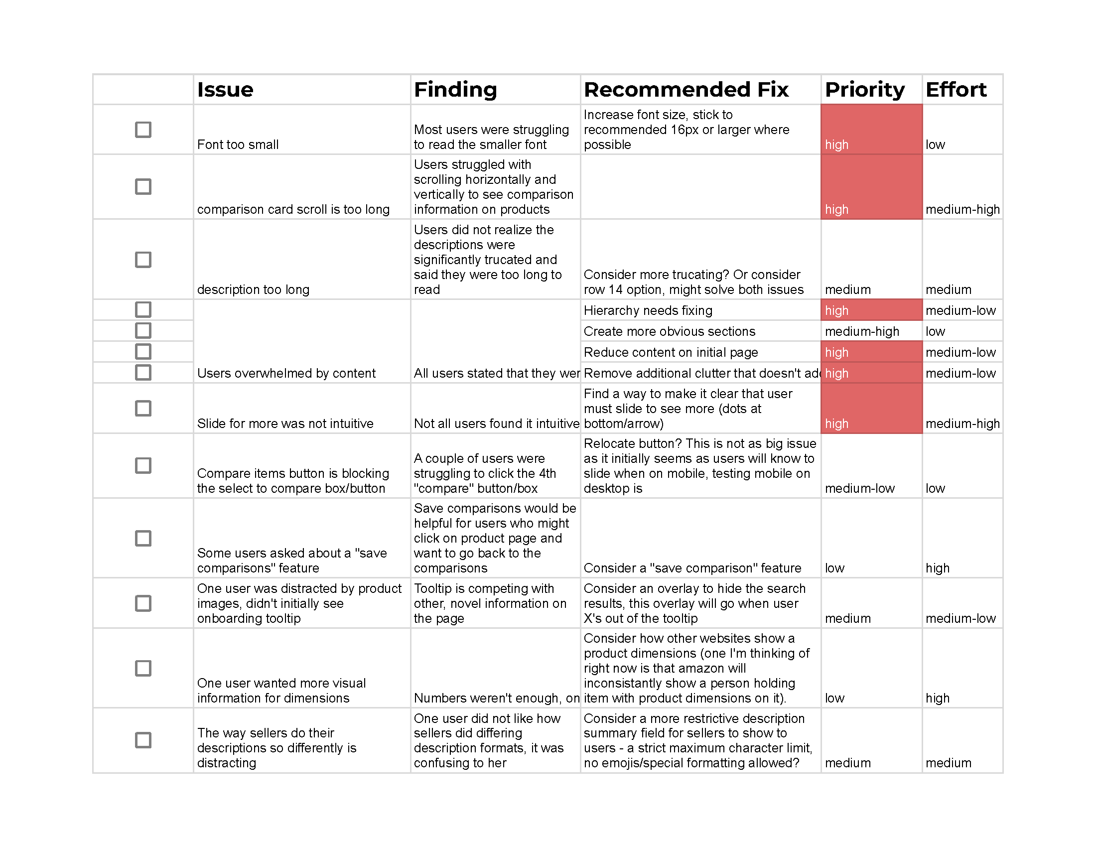
The affinity mapping helped me develop a priority revisions matrix so I could identify high value revisions to work on first and move from there to lower value and/or higher effort revisions if time allowed. Anything from this list that I could not get to could be added to the backlog list for post-launch.
Key takeaways
Users were excited to try the comparison tool
For key goals of learning about services and locations, the menu worked great, I observed all testers find the services pages and locations pages very quickly.
Oh this looks like something I'd really like to try!
The flow worked
I observed the users select items to compare quickly and with ease. With one user having questions about the compare button.
Users had the information they needed
When asked, users believed they had all the key information they needed to help narrow down their options and come closer to making a purchase decision.
Users struggled with the design pattern
All users in testing struggled with the UI used for the comparison tool itself. The font was too small, the columns too long and overall the information presented on the screen was overwhelming for users. They were unable to scan or focus on any part of the page.

At first glance it's a LOT of information. I would like it to be a little simpler

I'm not reading the information at all. It's too much.
Making it better
Rethinking the comparison tool UI
While this was a standard design pattern I had observed in all mobile versions of the comparison tools during my competitive research, it was clear this UI was not working in this case. A new design was needed to address the following key challenges:
- Scannability
- Font size
- Helping users focus on one or two aspects of the product at a time.
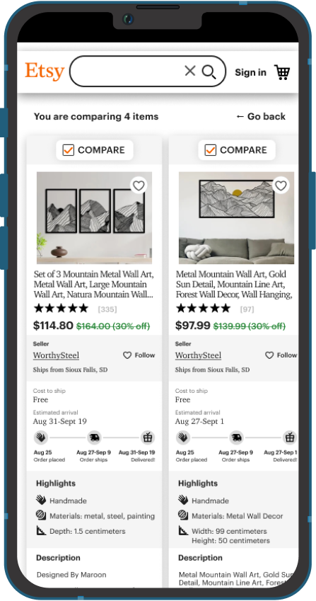
The design needed rethinking at a foundational level to ensure that it would functionally work for users. I spent some additional time researching and looking a ideas beyond comparison tools. During this research I discovered a design pattern with tables that I thought might work in this design. It meant turning the design sideways and with some quick wireframe testing, I could see that the new pattern would address all of the key challenges users faced with the original design.
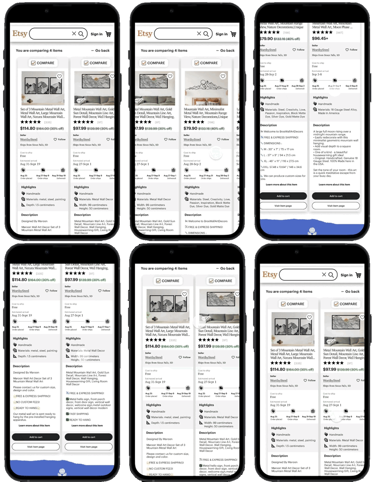
Initial prototype showing the difficulty of scanning the different items
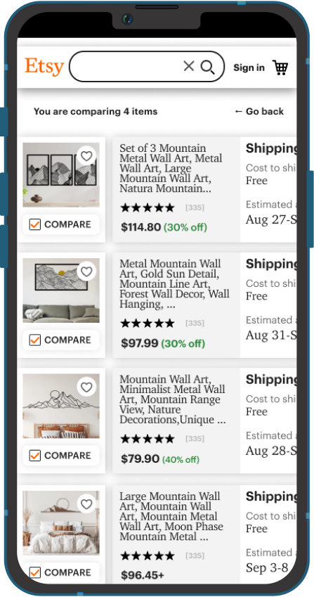
Updated prototype with products stacked
"I got distracted by the pictures"
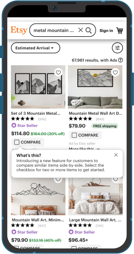
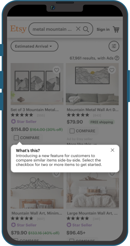
During testing a user said that she missed the initial tooltip because they found they were already looking at the pictures of the products on the results page.
Solution
Adding an overlay on top of the results page ensures that the tool tip will be more noticeable.
Compare items button
One user said that when they selected the first 2 items to compare and that the button appeared they were surprised they could pick more items since there was no indication that they could do that.
Solution
Since knowing additional items could be added relied on user to remember the first tooltip, I opted to add a second tooltip that re-iterated that users could select up to 4 items.
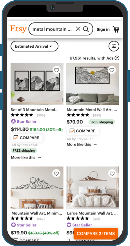
First version of the prototype with just the "Compare X Items" button
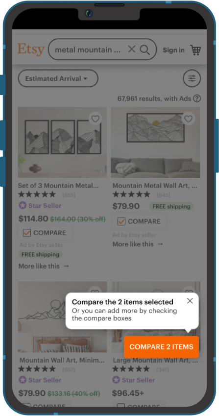
Iteration of the prototype with a tooltip to explain to users they can select up to 4 items to compare
Swipe to see
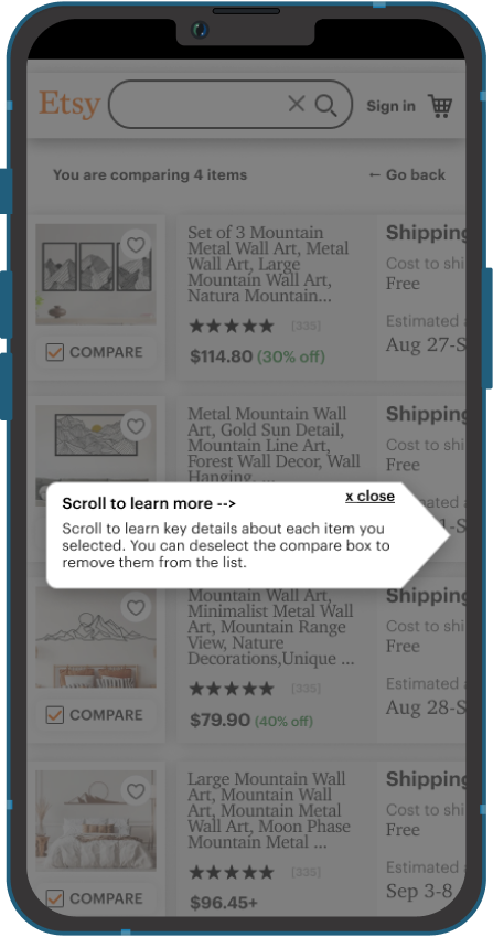
In the original design 2 users did not realize they could swipe to see more items. At least one other user hesitated initially on this screen before swiping.
Solution
While the new design looks like it will be more clear users should slide to see more, I felt it important to onboard users to the new design with a tooltip.
Next steps
Since this is a new design pattern, unlike those used in other comparison tools, the next step will be to do some additional user testing to ensure the tool works as anticipated.
- Add items left in the the priority revisions matrix to the backlog list for post-launch.
- Explore adding a feature where the items being compared can be reordered. This would likely assist user further in that comparison and had come up with a couple of users who wanted to move the items they wanted to see side-by-side.
- Explore if adding more items to compare might work.
- Review how users can save comparisons for later review.
- For additional support of this feature, it might be helpful to have a summary description field that restricts use of emojis or other formatting that makes the descriptions difficult to scan when comparing items.

