Insuranceful
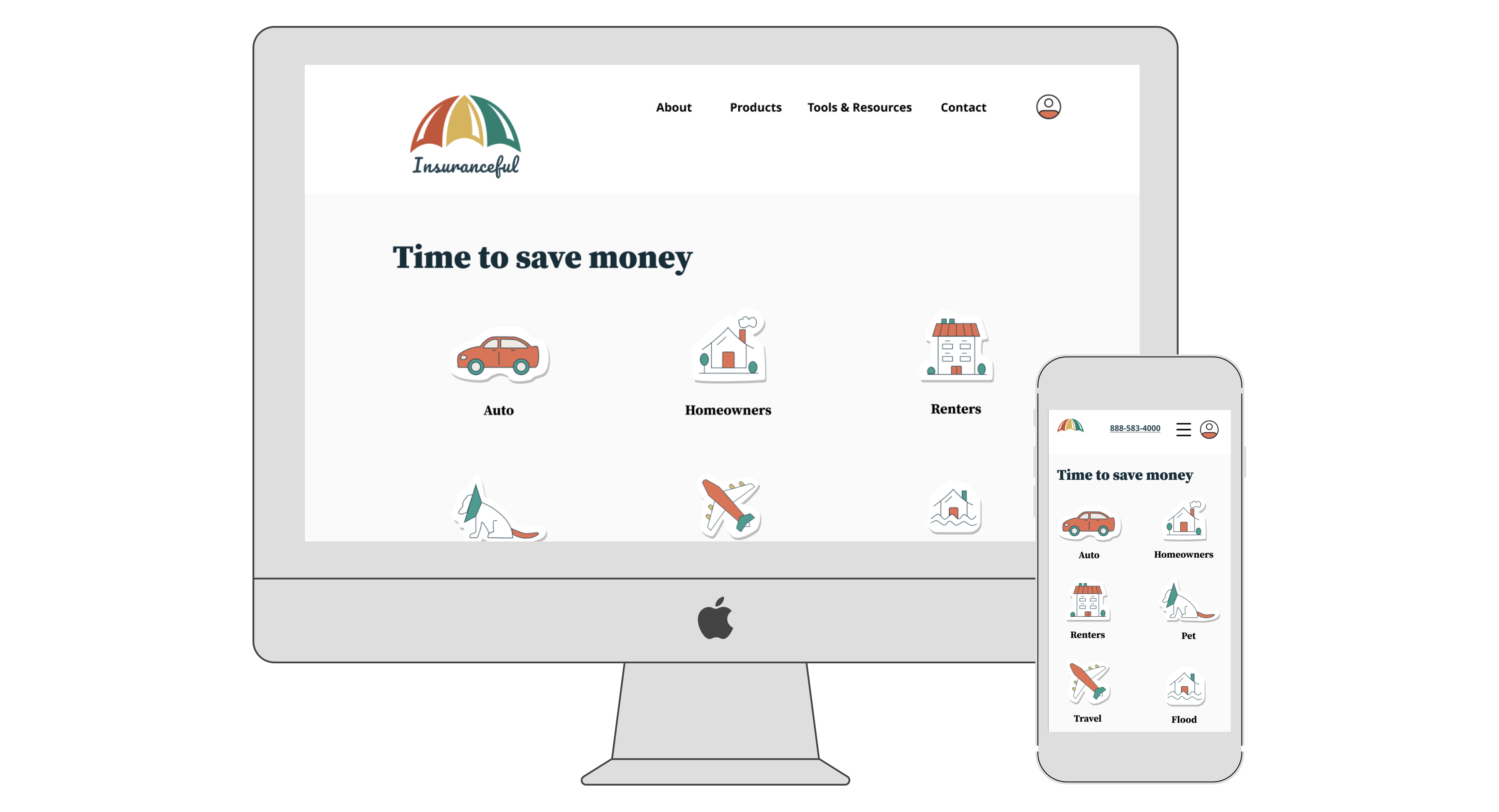
A responsive website design.
Overview
Project Type
Independent
My Roles
- UX researcher
- Information architect
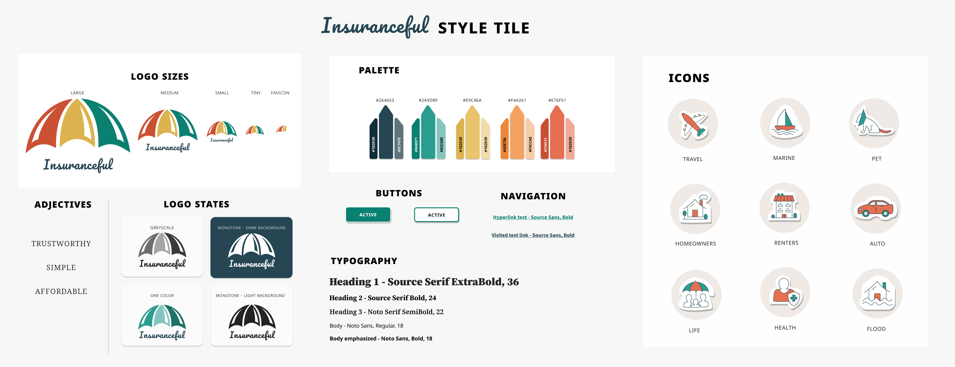
- Brand designer
- UI designer
- UX tester
Tools
Figma
Optimal Workshop
Miro
Whimsical
Length
80 hours
Background
Insuranceful is rebranding from Kaus insurance, they have sold insurance to businesses for 30 years and now need to offer insurance to customers by way of a new website. That is “modern and clean and easy to navigate”.
Problem
Users find insurance to be difficult to understand, overwhelming, and not well trusted.
Goal
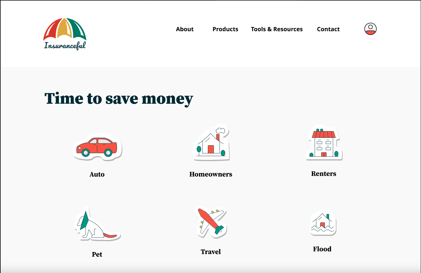
The goal is to create a responsive website design that is modern, but more importantly, offers navigation that is easy to use and effortless insurance sign up.
Solution
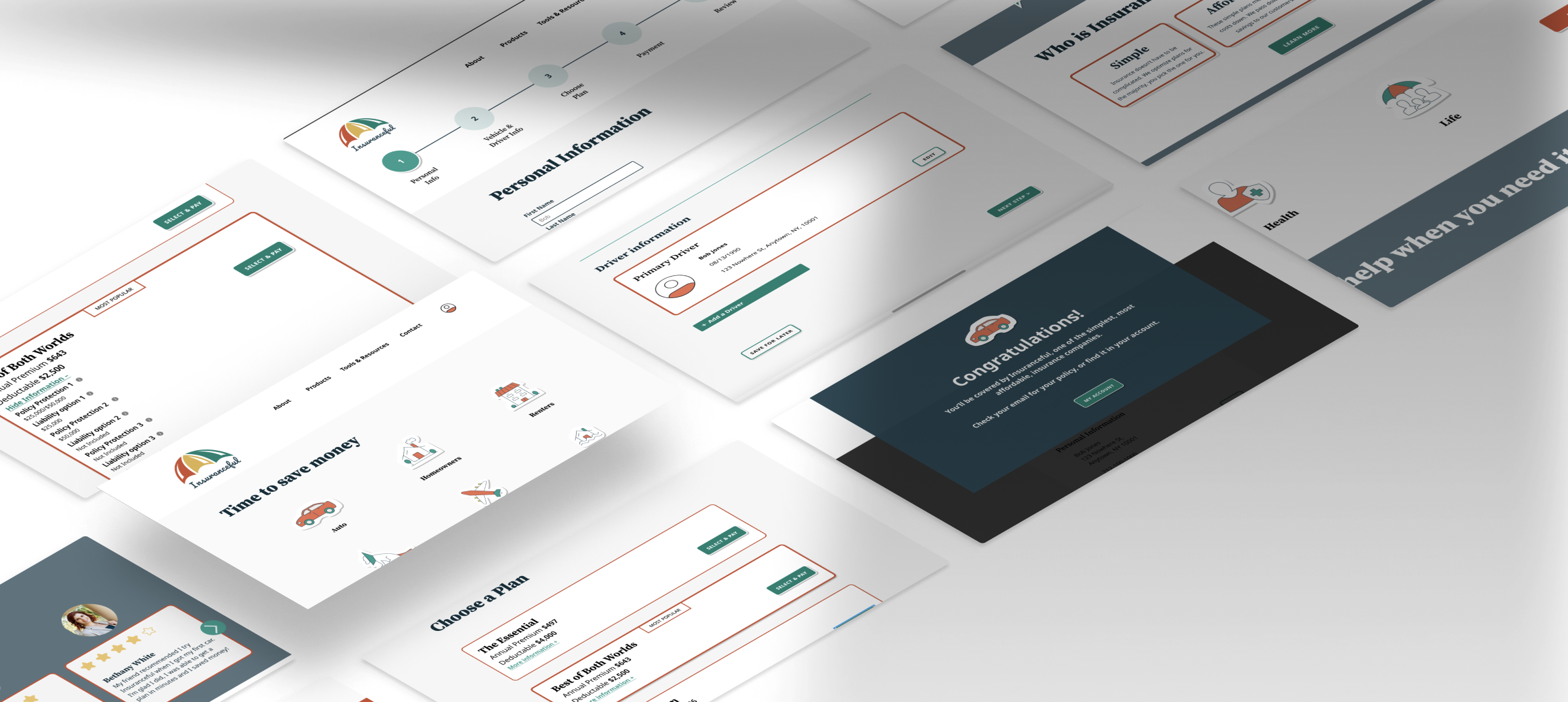
I designed key pages to test and demonstrate the flow for signing up for auto insurance.
Process
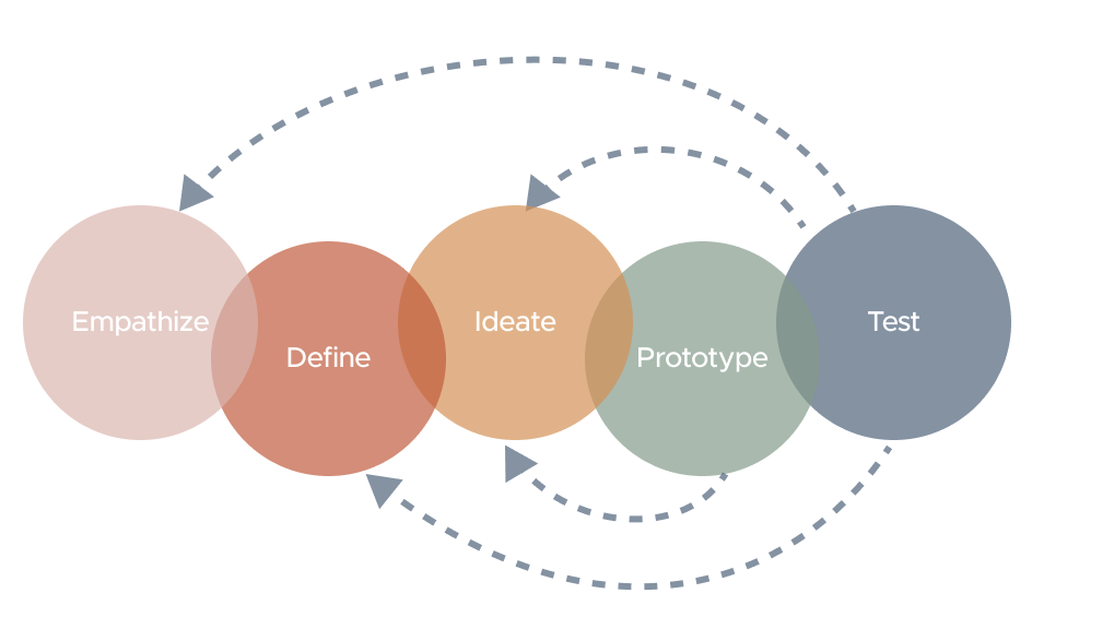
Through my design process to empathize, ideate, design, test, and iterate I saw users found insurance to be hard to understand, overwhelming, and not well trusted. I worked to create a design that would be easier to use and trustworthy. I will share here my process of how I did that.
Discovery
My initial goal was to better understand insurance users and how insurances are currently offered online. So I started discovery with determining key questions:
- Learn how competitors present their product and other information to users. And identify design patterns in this product space.
- Who the users are; their motivators for finding new insurance and their needs when looking for that new insurance.
- Understand what makes a user choose an insurance provider, what their likes and dislikes about current options are.
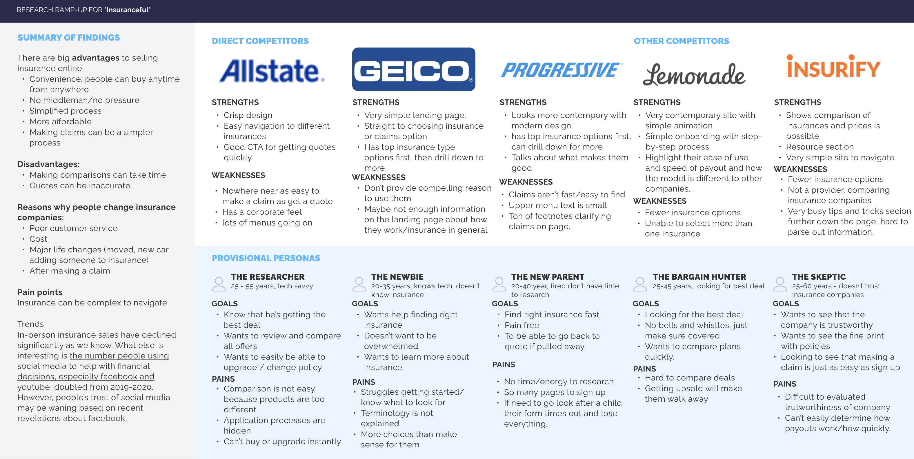
Secondary Research & Competitive Analysis
My goal was to better understand insurance companies and the insurance product space. The way competitors present products could help me see patterns and better understand when users talk about what they like and what they find challenging with insurance
Competitive analysis of 3 direct and 2 indirect competitors to Insuranceful
One-On-One Interviews
I interviewed 4 people one-on-one for approximately 30 minutes. My objective was to understand what makes users choose insurance providers and their likes and pain points with their current plans. I was also looking to see what aspects about an insurance company would help them feel it is trustworthy.

Kandice
Age: 44
🏠 owner
🚘🚘 2 cars

Chris
Age: 51
🏠 owner
🚘🚘 2 cars

Dianne
Age: 44
🏠 owner
🚘🚘 2 cars

Bethany
Age: 38
🏠 owner
🚘 1 car
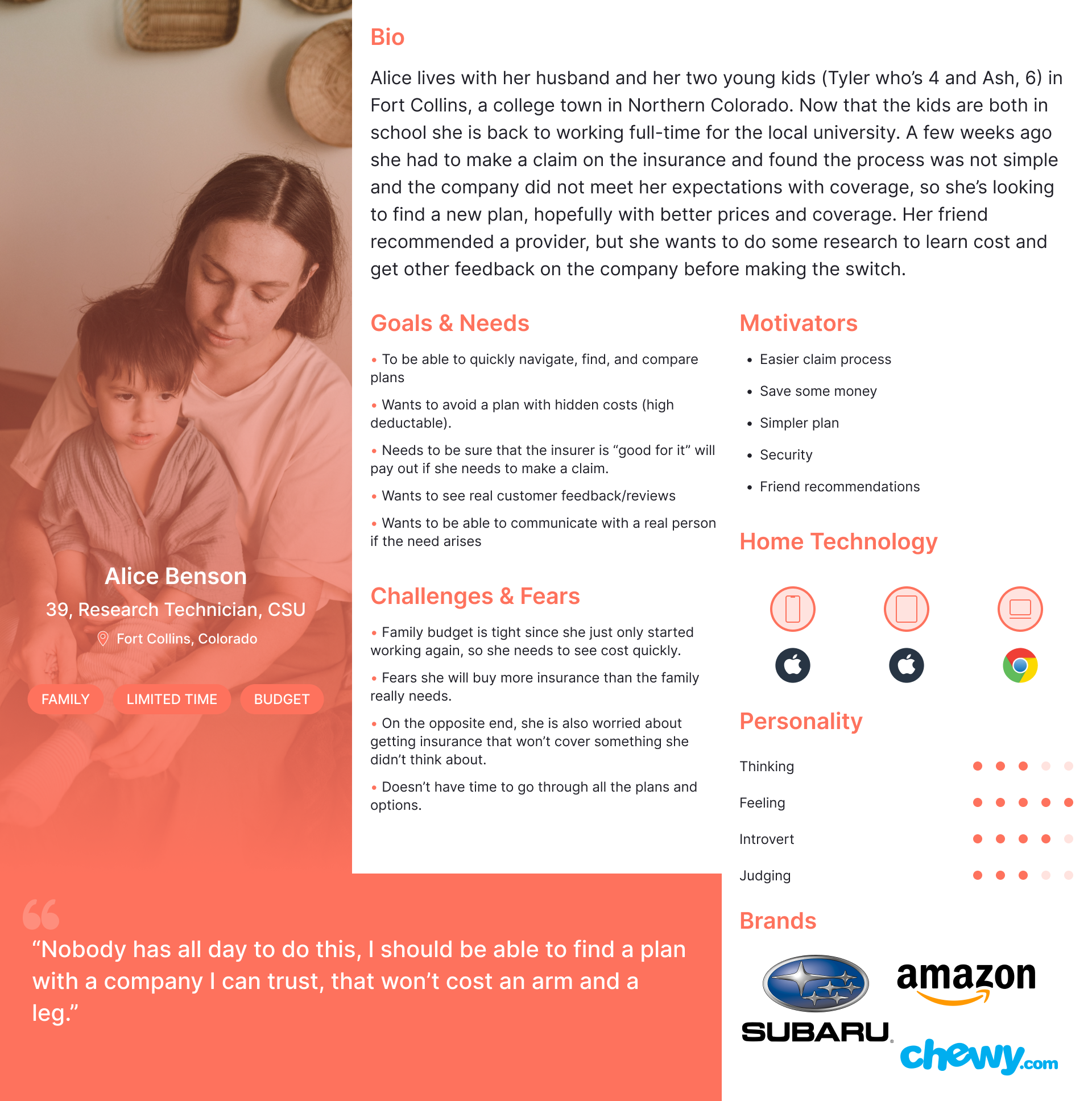
Persona - Meet Alice
Based on the interviews, I created Alice's persona to help make user decisions throughout the design process.
Alice Benson is looking to save some money with the right insurance for her. Her budget and time are limited, so simplicity and speed are key considerations for Alice. Knowing the cost up front along with an opportunity to learn more were both additional considerations.
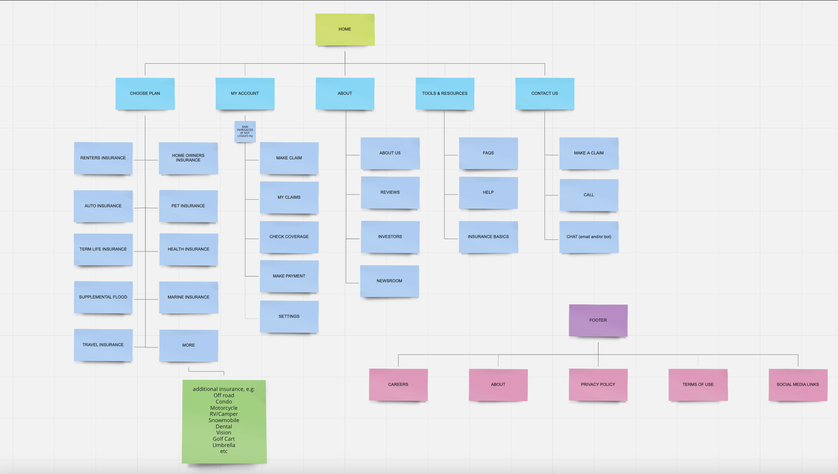
Card Sort
My goal was to create minimal menus on the website to help users focus and avoid adding to the overwhelmed feelings they expressed when looking for insurance.
To help ensure that items went into the right part of a minimal menu I used a hybrid card sort with 10 participants, 20 cards and 4 categories to clarify where key topics made sense for users. The card sort helped me understand how users would choose/categorize different insurance plans and other key pages on an insurance website.
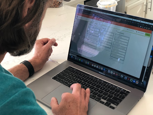
A user participates in a card sort using Optimal Workshop on a laptop
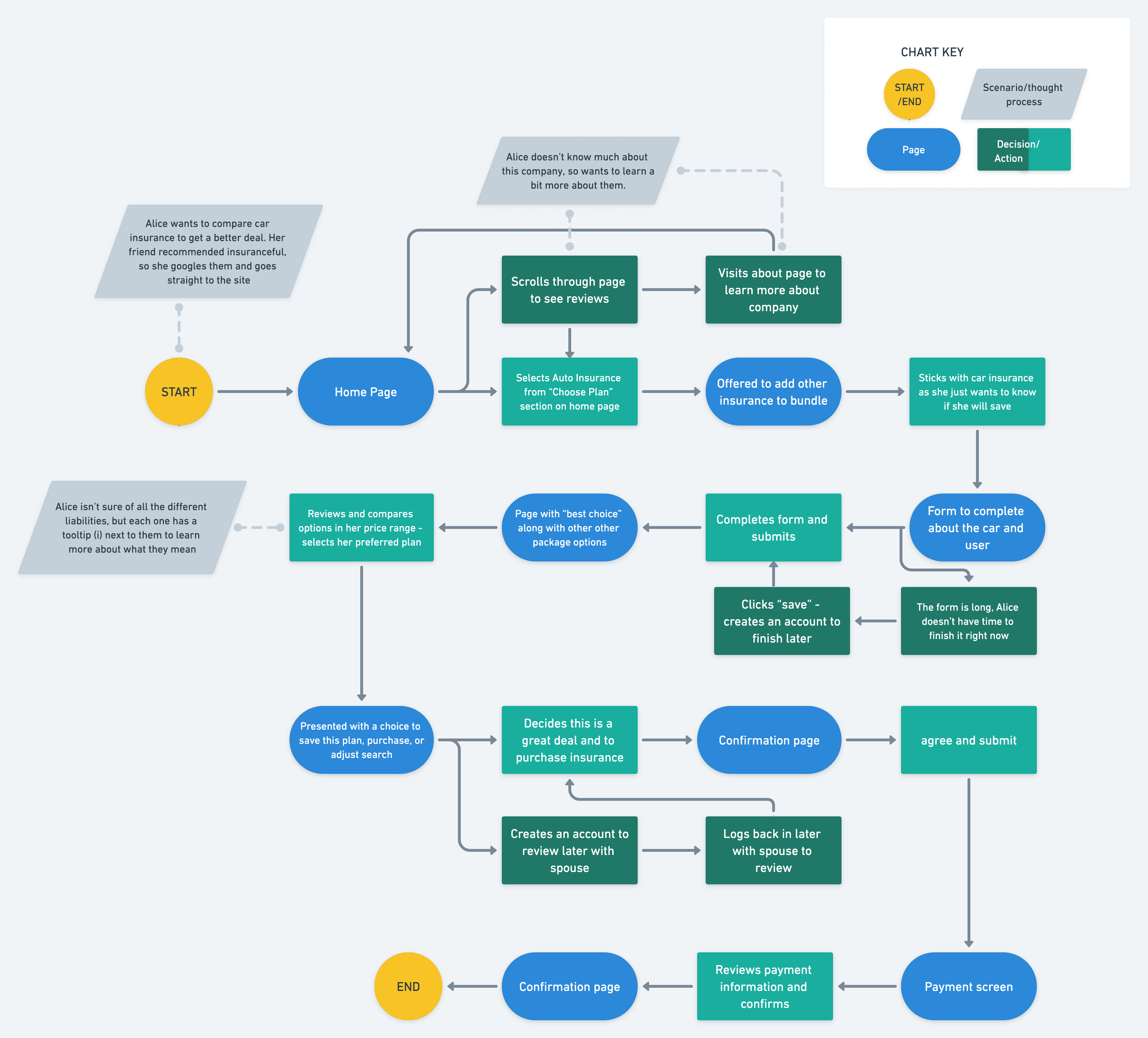
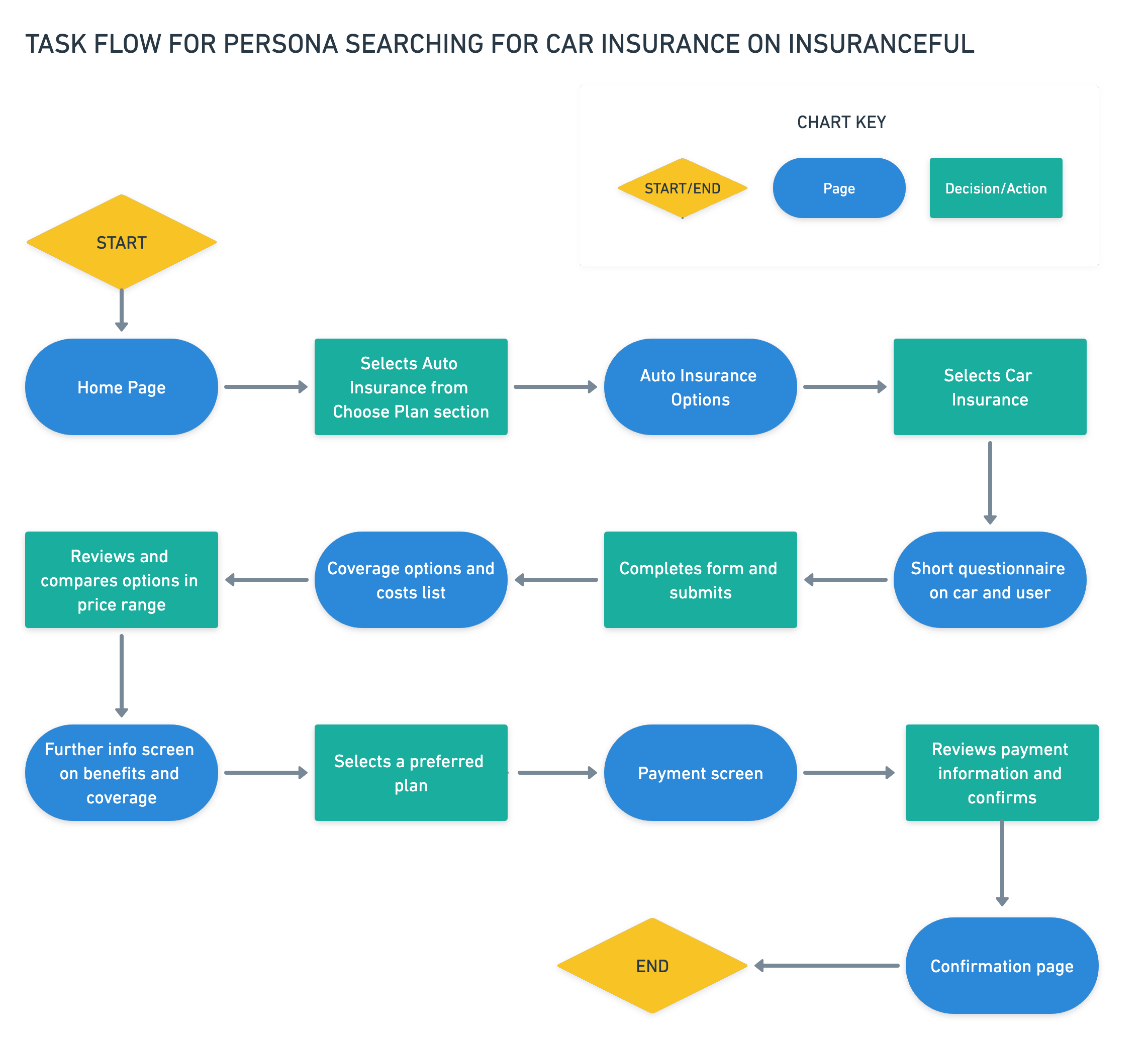
Task Flow
I created a task flow to understand the steps a user would take to purchase auto insurance.
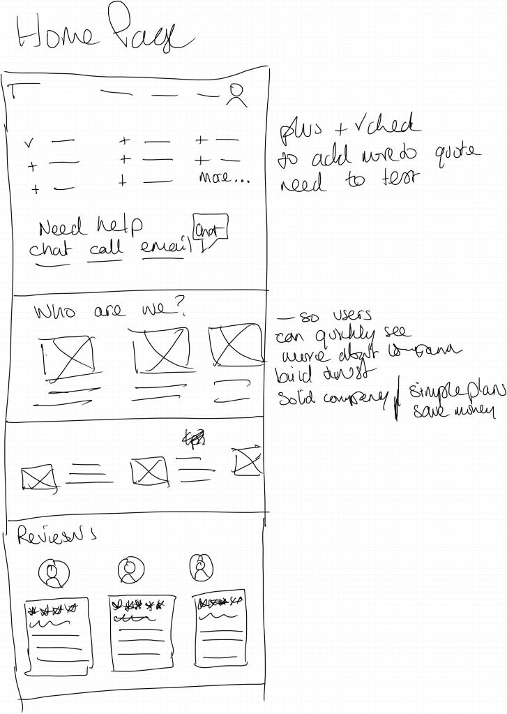
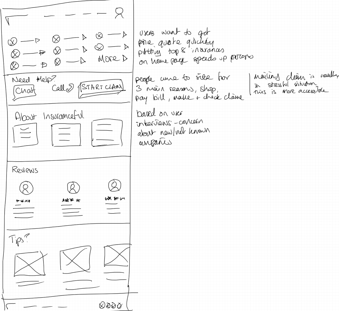
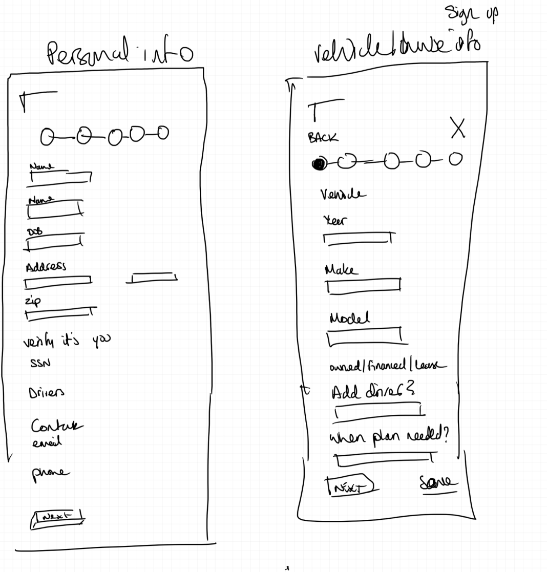
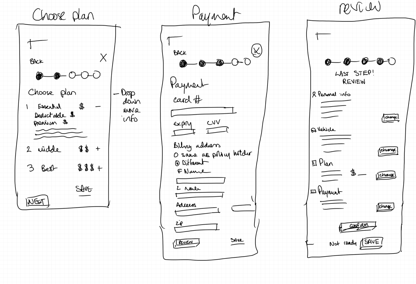
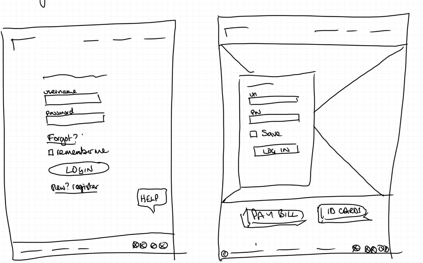
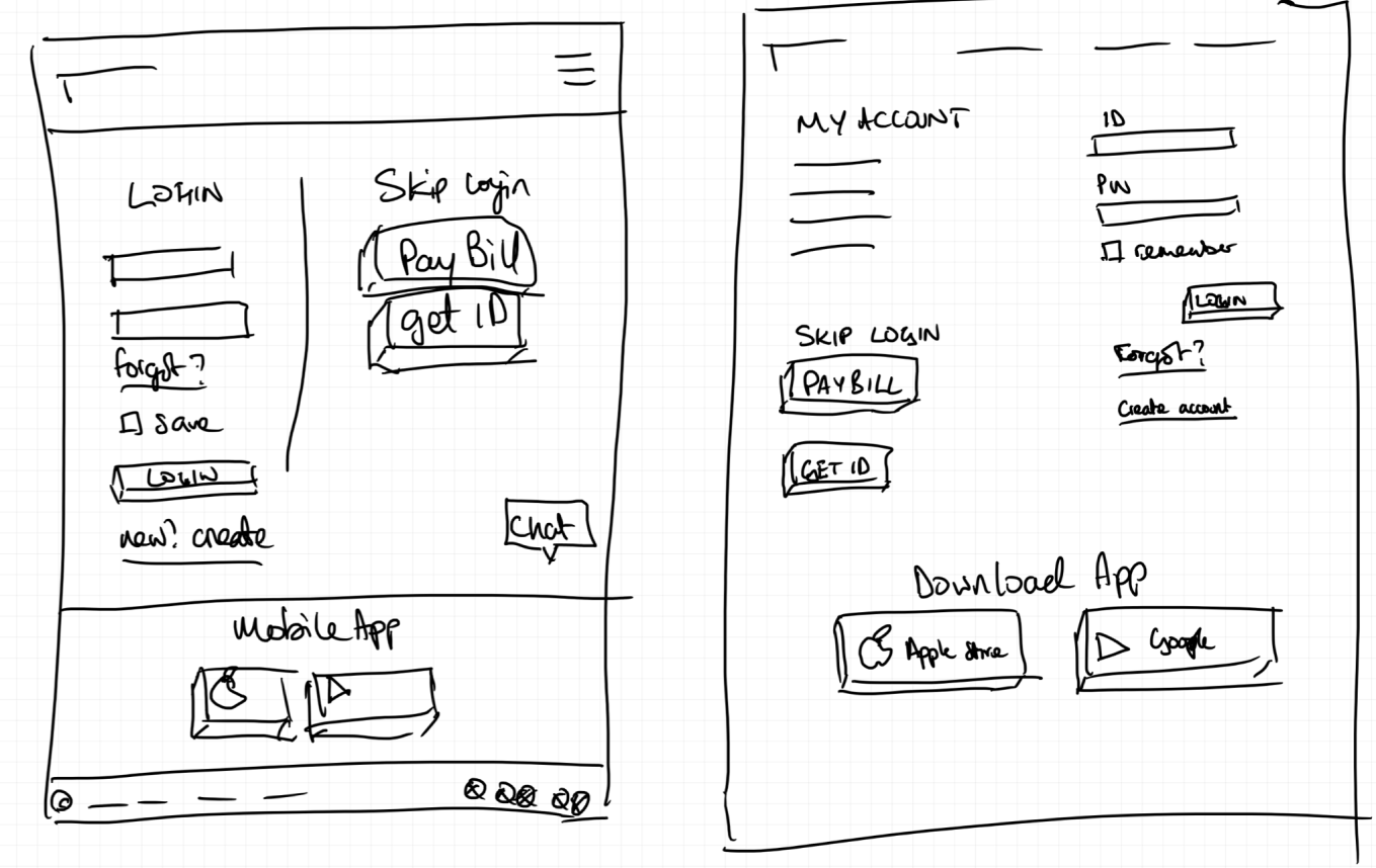
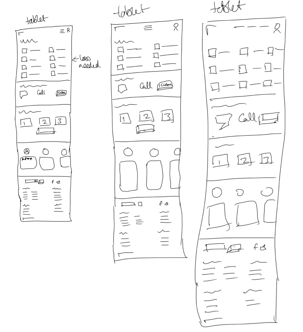
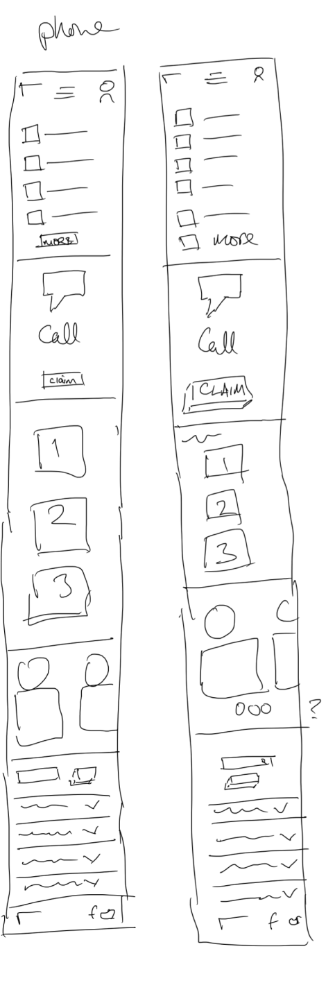
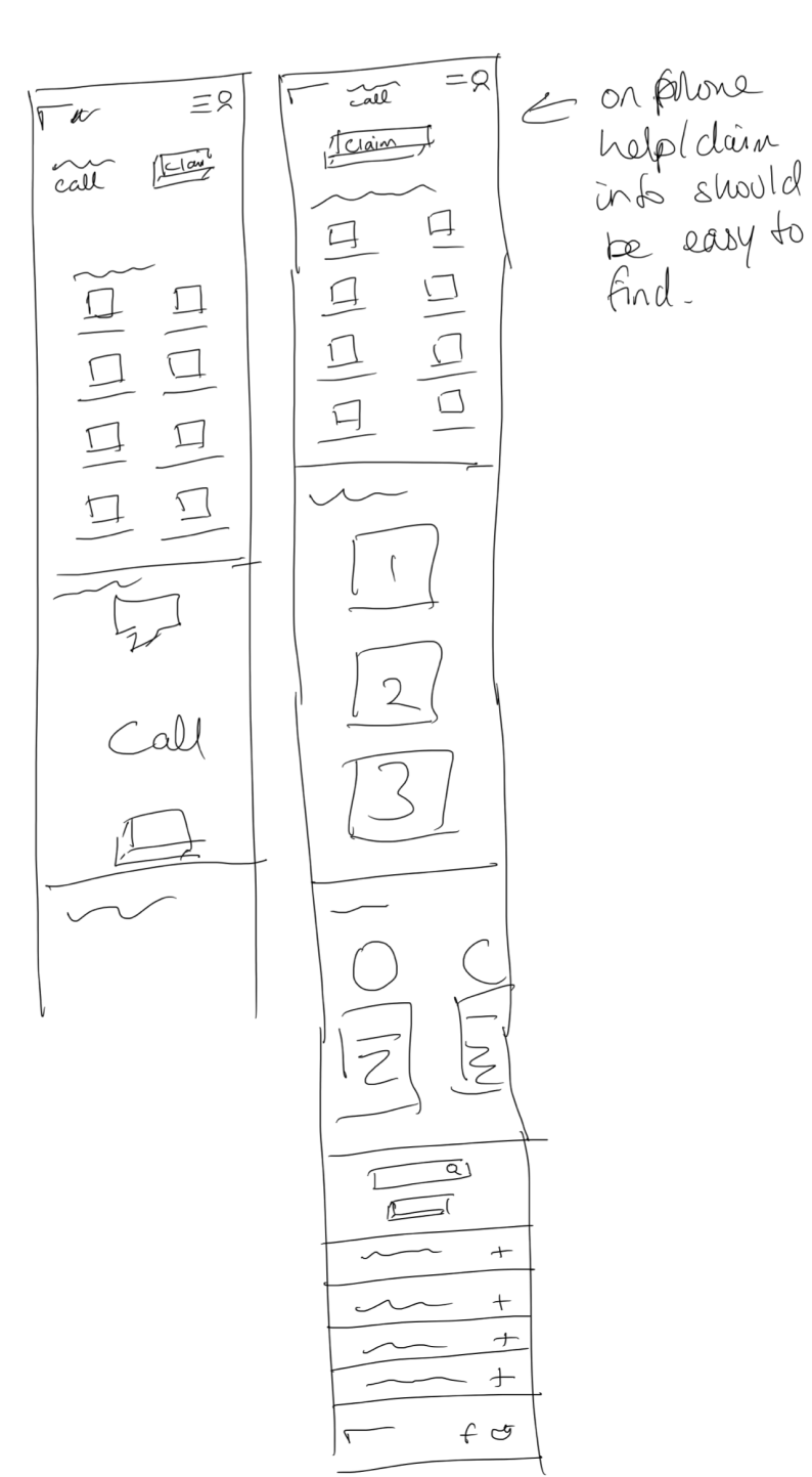
Rapid Sketching
I started with some very quick sketches to explore ideas based on what might be needed for the pages I'd be creating. This gave me the opportunity to fail quickly with ideas that would not have worked and delve more into concepts that had legs.
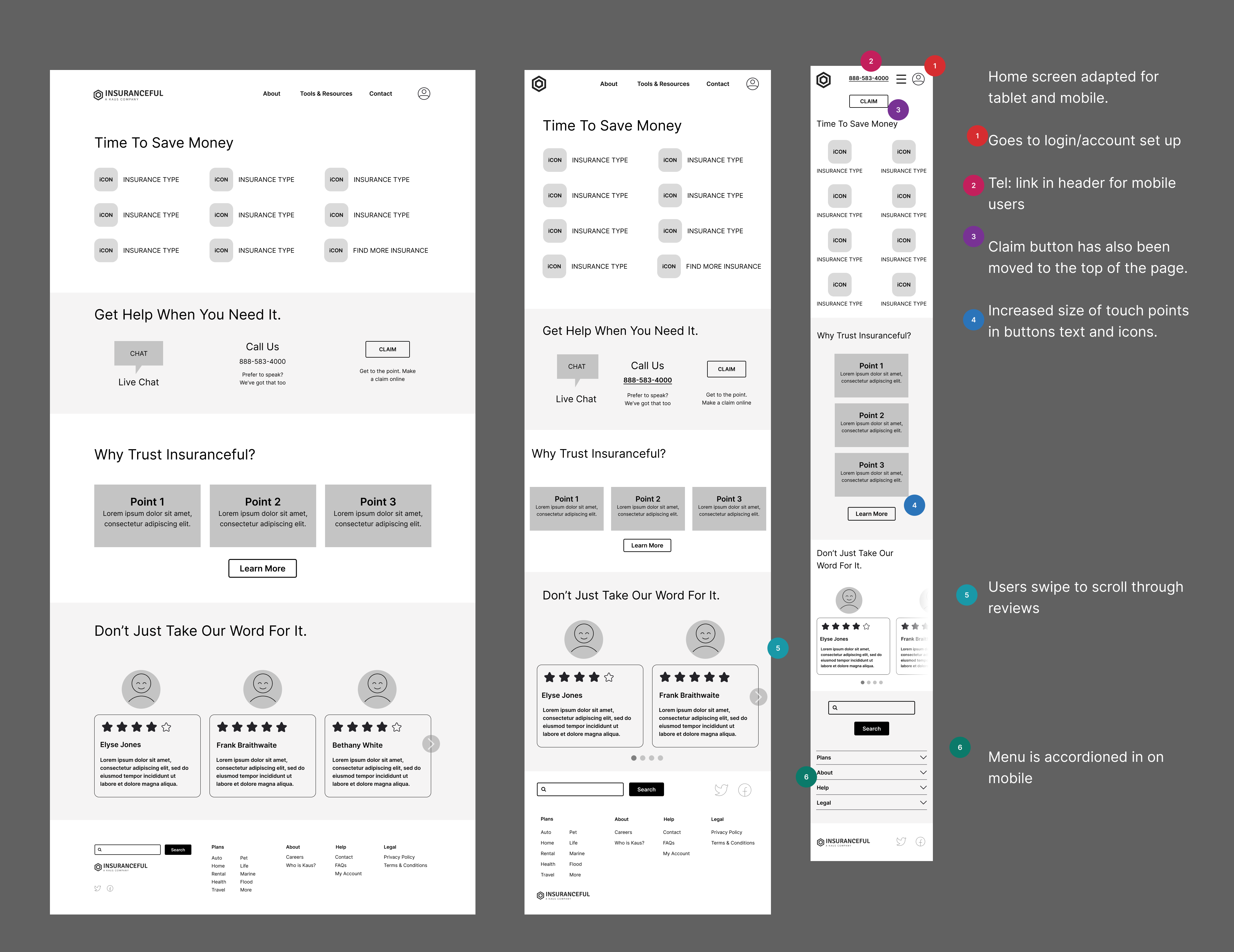
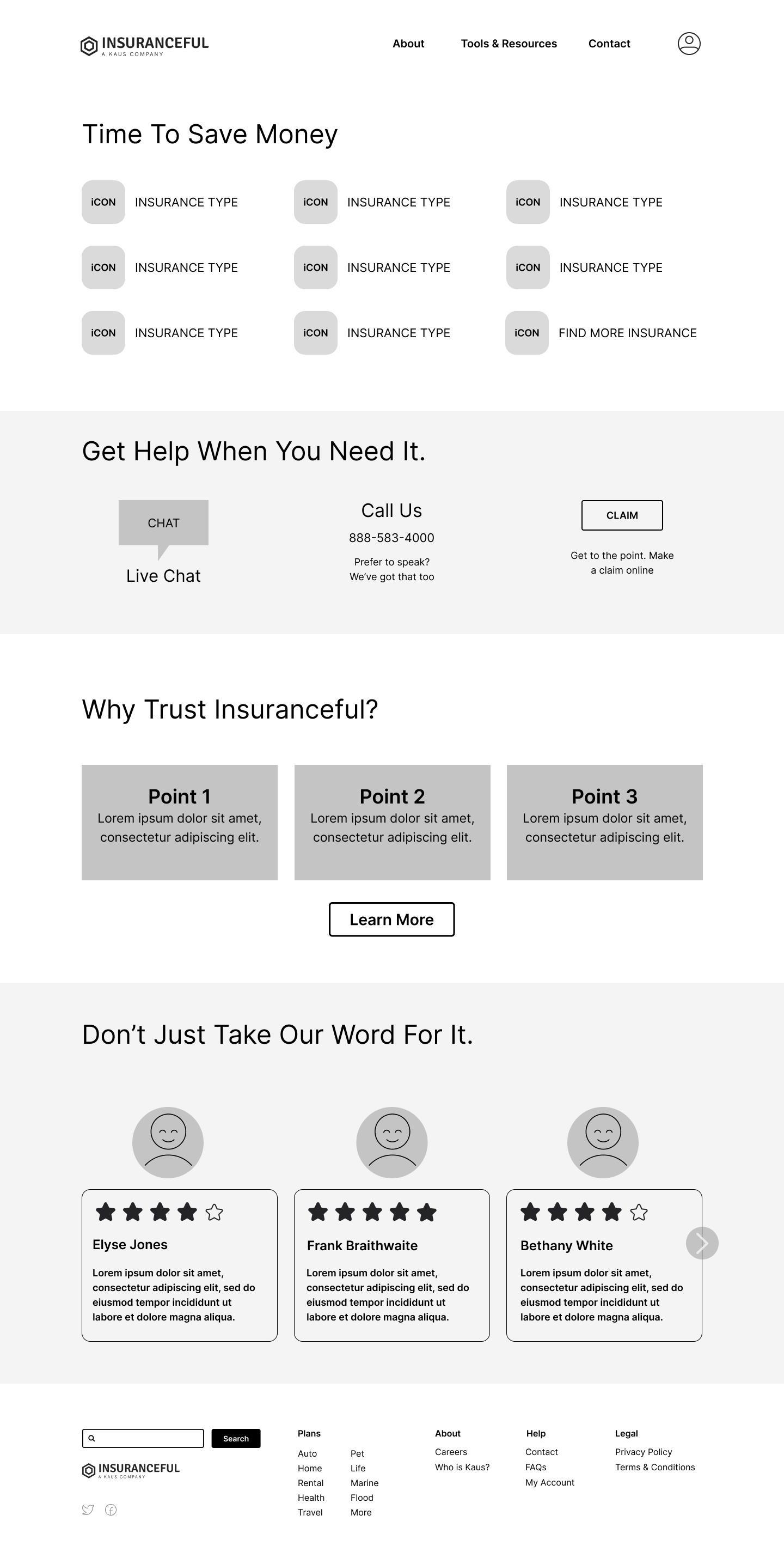
Responsive wireframes
Creating low fidelity responsive wireframes and prototypes helped move things forward quickly and obtain feedback to prepare for testing. Initial review with other designers helped lead me to improving visibility of quick quote buttons and increasing whitespace in the overall design.
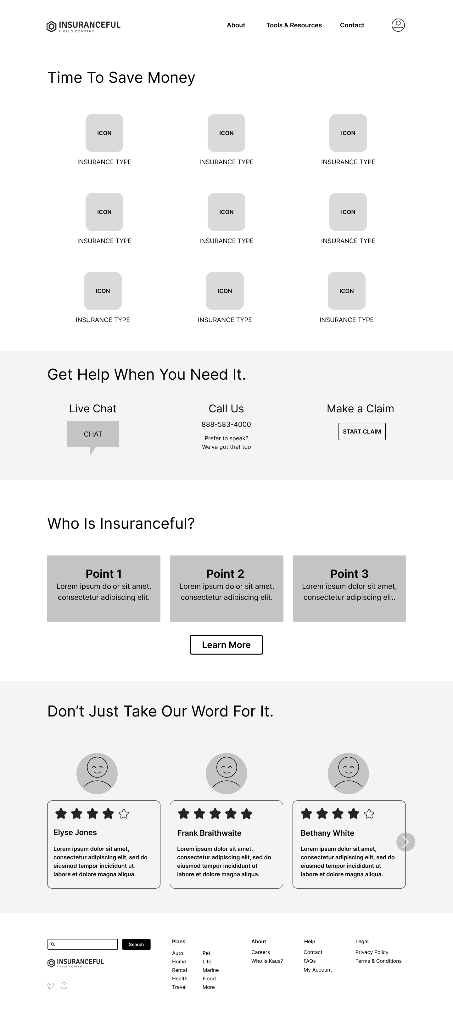
Responsive Wireframes Iteration
After reviewing wireframes I decided to make some design changes to increase the size of the insurance buttons and center so that the choices looked less "list-like", improve appearance overall, and increase whitespace.
Usability Testing
Once branding, designs, and UI were ready it was time to create mid-high fidelity screens so that I could test user task flow with a prototype. With the prototypes I wanted to:
- determine if the flow was effortless
- ensure that users are not overwhelmed
- see if users trust the site
- identify any points of friction/places for improvement
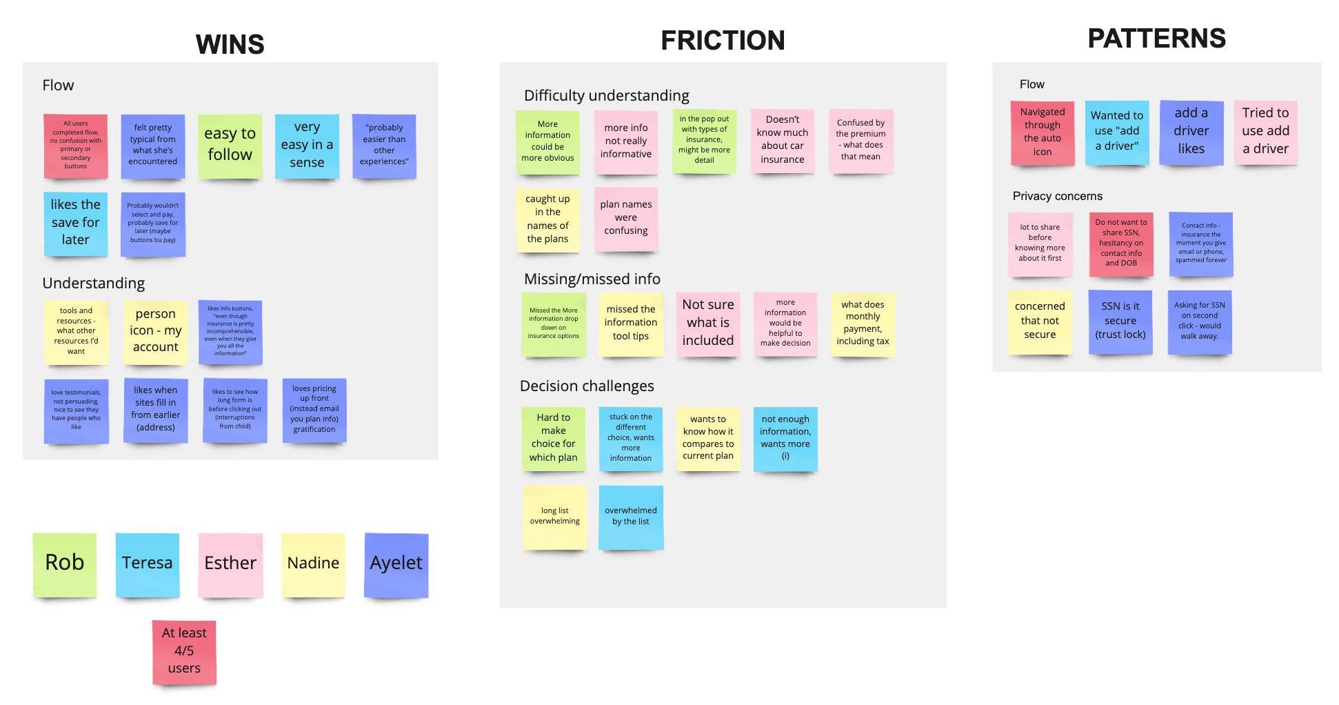
I opted to moderate the prototype testing meeting with five users aged 32-52.
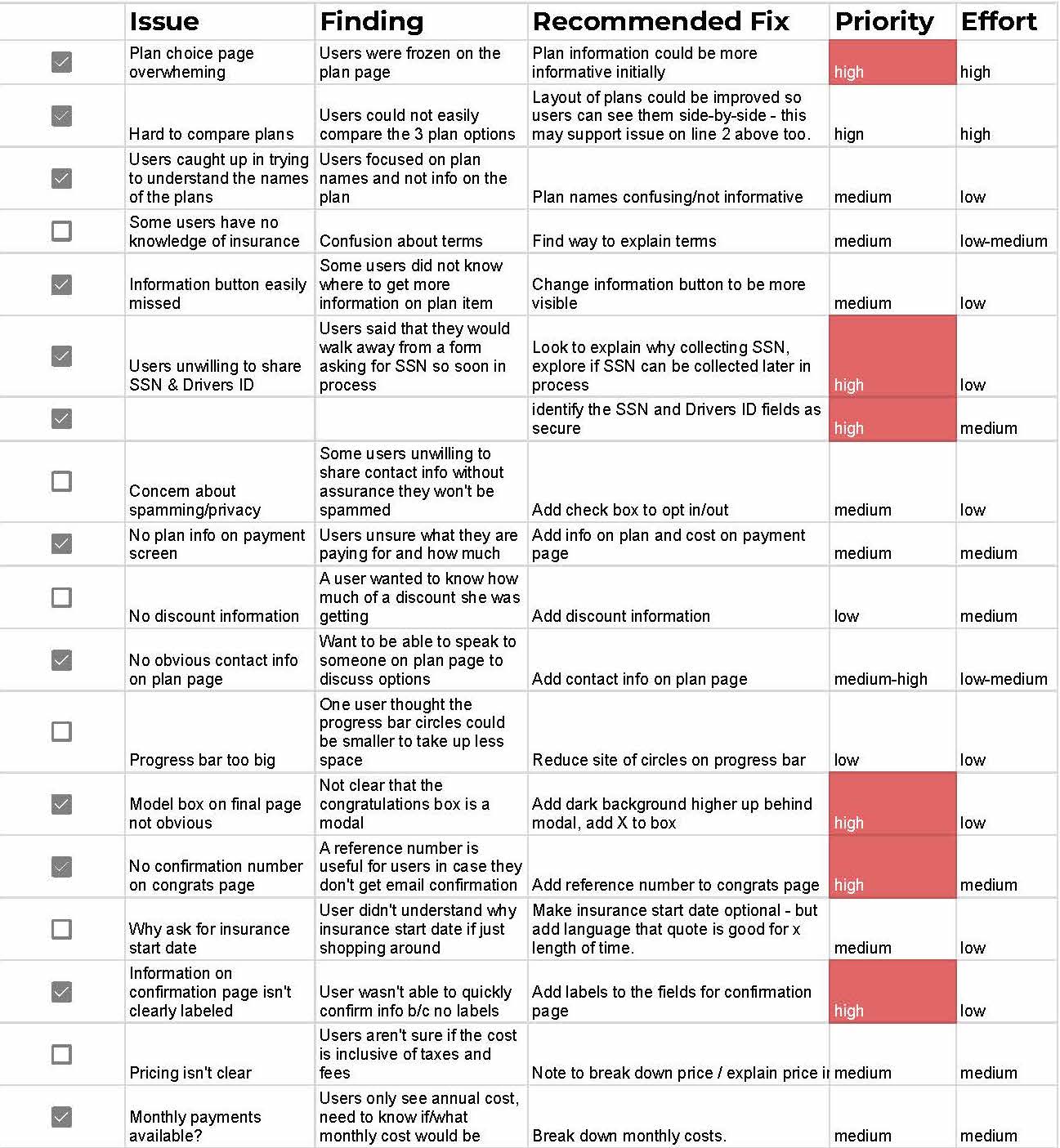
Priority Revisions Matrix
The mappings helped me create a priority revisions matrix which helped me identify high value revisions that I would work on first and move from there to lower value and/or higher effort revisions if time allowed. Anything from this list that I could not get to would be added to the backlog list for post-launch.
Key takeaways
About the form:

Love that you can save for later, so you can check other places and come back.
Users were easily able to follow the form pattern, such as next steps, save for later, add a driver.
On transparency:

It's great that you get the numbers up front! Instant gratification.
Users want to know insurance cost right away, several users expressed challenges of searching for a quote only to be met with a "someone will be in touch" message.
On privacy:

Asking for my social on the second click? I'd walk away.
Most users struggled with concerns about privacy, specifically regarding sharing a social security number. Since this is a require step in insurance underwriting, users needed help understanding why their SSN was need and also need to feel confident that it would be secure in this form.
On comparisons:

I don't understand the choices, there's not enough information.
Many users were slowed down on the comparison page, their behavior indicated they were overwhelmed and didn’t think they could make an informed decision. Most of the users could not articulate specifically what made the page difficult, but many expressed concerns about understanding differences/making an informed comparison.
Iteration
Plan comparison page
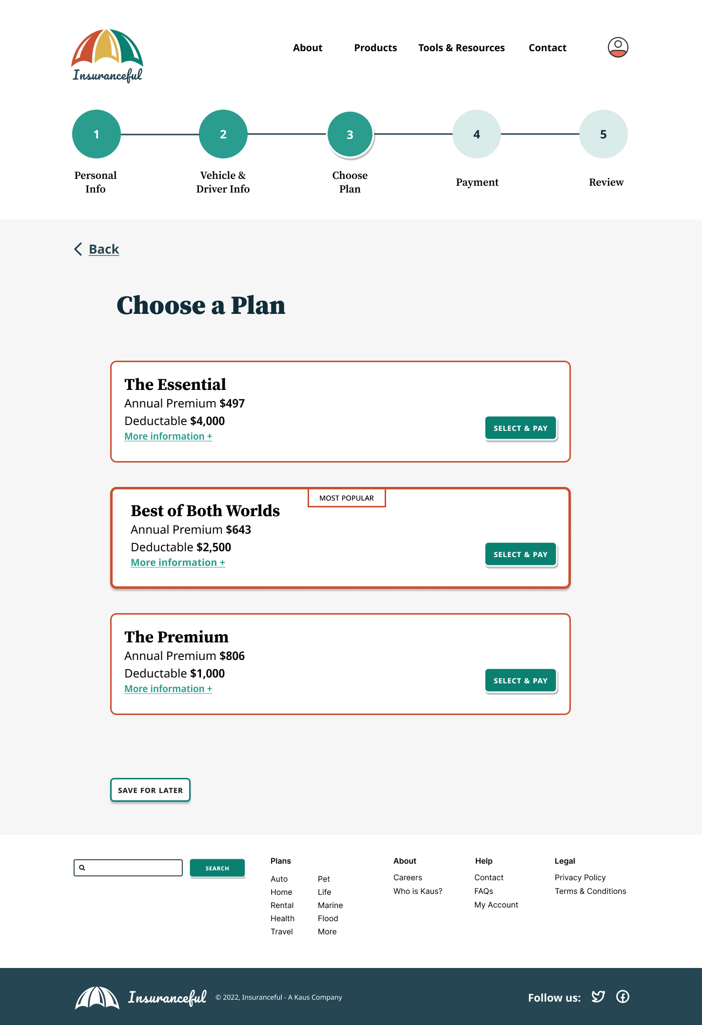
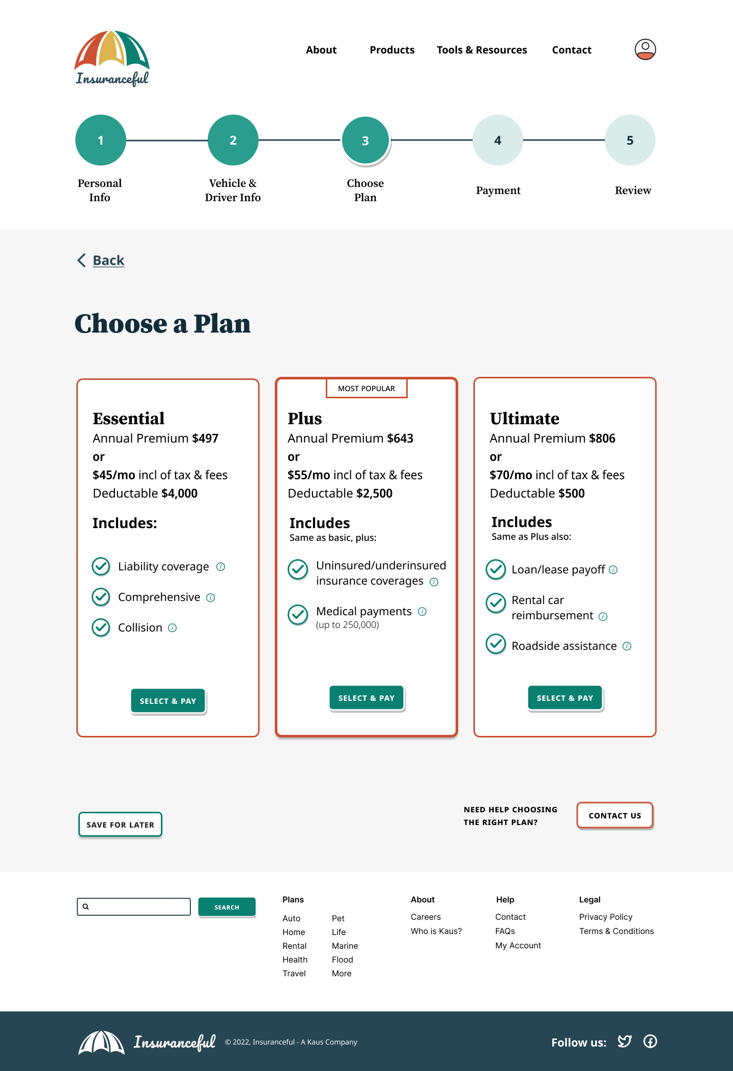
The most opportunity for improvement was found on the plan choice page. I observed users struggle to move forward from this page, some stated they could not make comparisons, some said there wasn’t enough information, some wanted monthly or yearly payment options/costs and to know if this was full cost, others wanted to be able to quickly reach out to support for more help choosing.
- Since the design wasn’t meeting users needs, I took a step back and decided to redesign the page to have the 3 plans side-by-side, affording users the opportunity to more scan and compare plans.
- Added overview information on the plans in the comparison view.
- The information tooltip design was updated to be more visible.
- Plan names were changed to something more easily understood.
- Added monthly costs, noted cost is inclusive of taxes and fees.
- Added a contact button to the bottom of screen.
Security
Most testers expressed concern about sharing their SSN and had questions about the security.
Solution
Security worries are the opposite of what we want to happen when trying to gain the users trust. With this in mind, the design was updated with a more info question mark to explain the purpose of asking for SSN and license numbers. Padlock symbols were also added to the field to indicate to users that the field is secure.
Payment
Several testers expressed a little confusion on the payment screen, they weren't sure they had selected the right plan and could not confirm on this screen.
Solution
I designed an additional information block containing an overview of the insurance the user selected. Since monthly and annual options were added in the plan options page, this needed to be included on the payment page for the user to choose from, also providing a visual reminder to the cost.
Next Steps
While it's true that design work is never done, it's important to continue to focus on priority revisions and remain focused on the aspects that are most helpful for users and important to stakeholders going forward. I think the next steps for this project would be:
- Ensure the items in the the priority revisions matrix are added to the backlog list for post-launch.
- Look into adding more payment methods (e.g. apple pay) for users to choose from.
- Explore the user flow for accessing account information.

