Toyful
An end-to-end app
Meeting user desires and needs to create a toy exchange app concept.
Overview
Project Type
Independent
My Roles
UX researcher
Information architect
Brand designer
UI designer
UX tester
Tools
Figma
Maze
Miro
Length
80 hours
Background
I wanted to explore if an app could help connect people to gift and receive toys in order help save money, minimize clutter, help rotation, and reduce waste. In researching, I found toy libraries, and some toy exchange apps around, the former came with a financial cost and the latter was poorly utilized, suggesting low uptake.
Problem
A great many toys on the market are low quality and often considered landfill-ready. Higher quality toys, come with a higher financial cost, especially since they are played with for a relatively short time, and sometimes not played with at all. I wanted to learn how we might connect with like-minded people to "trade in" outgrown/unused toys to obtain different pre-loved toys.
Goal
My goal was to create an app where users to list toys and find toys with ease. All using a credit system as a way to "swap" for other toys listed on the app.
Solution
To create an MVP what will allow users to quickly and easily find toys and connect with the gifter.
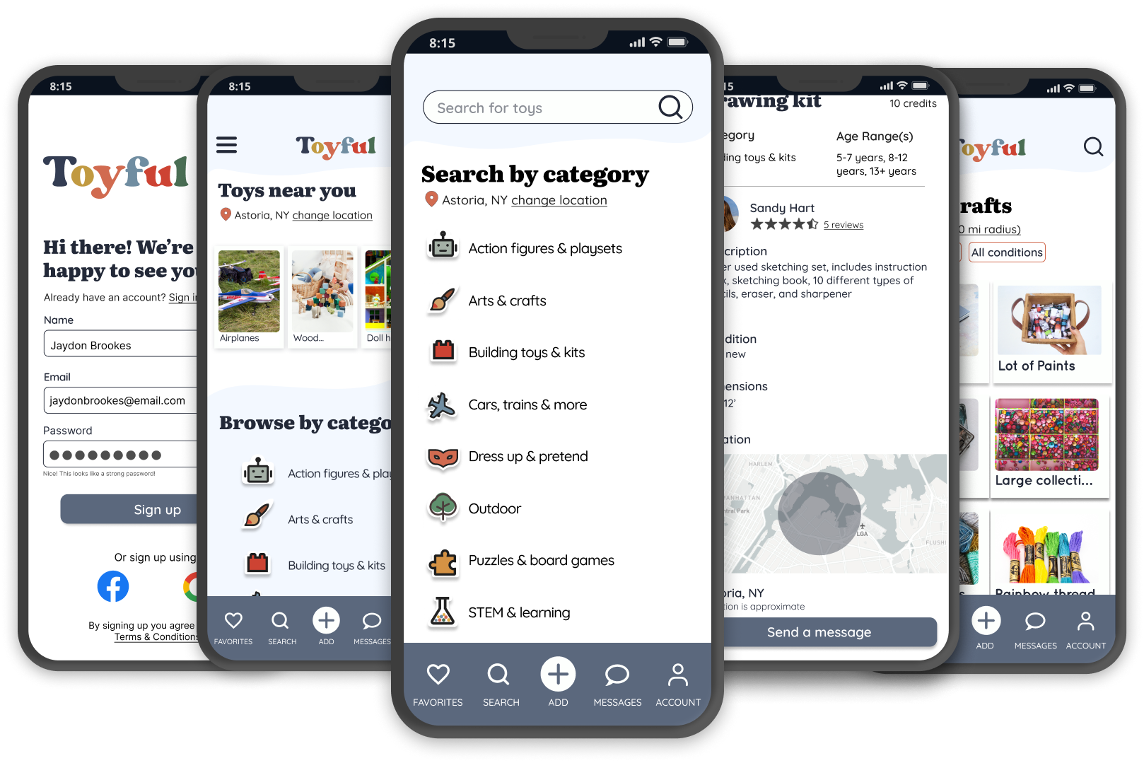
Prototype of the Toyful app in action
Process
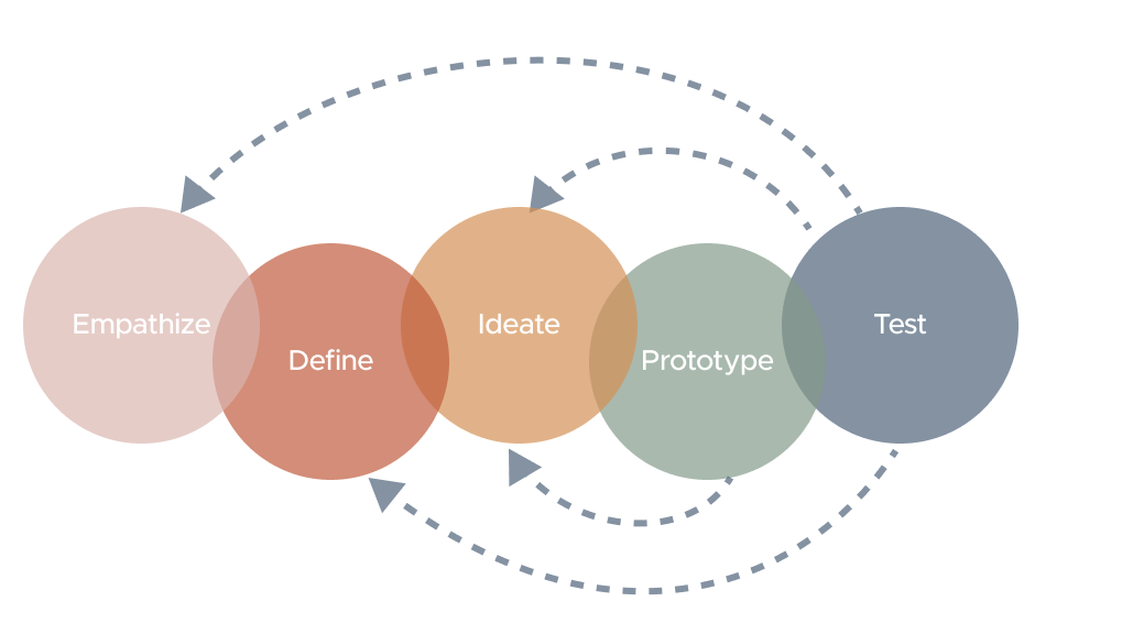
I take a user-centered design thinking approach when undertaking a project, this strategy includes the processes shown in the diagram below. My primary goal is to empathize with the users to define the problem, ideate, prototype, and then test to ensure my designs are intuitive and accessible.
Understanding the toy exchange space
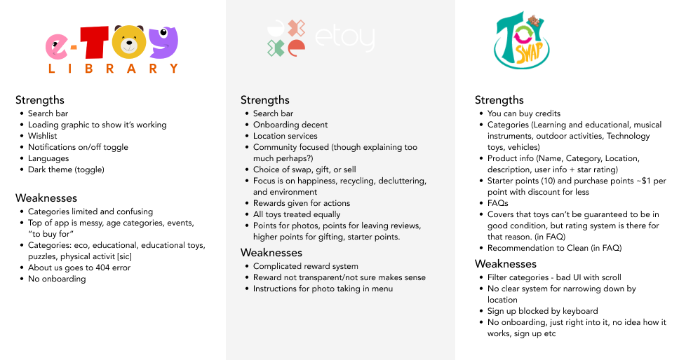
I started out by looking for apps that already offer some kind of toy exchange so I could identify patterns and their strengths and weaknesses. This lead me to review 3 apps:
- Etoy
- Toyswap
- E-toy Library
Takeaways
- Onboarding is a valuable tool that some apps used. It helped set expectations and reminded users of the benefit of a toy exchange. However, the onboarding I experienced tended to overload the user with information too soon.
- Location services were helpful on some apps, but they didn't offer the opportunity to add a ZIP code instead.
- Etoy and Toyswap both used a credit system to offer a fairer way of doing an exchange, since direct swaps are not realistic. Both systems had complexities that could easily overwhelm a user.
- FAQs are a nice way to inform users of expectations, but it seemed unrealistic to put all important information there. Better to share essential information in onboarding or through tooltips.
- Search bar is standard on all apps, however good categorization will be more valuable for users in this space where there's less choice.
- A bookmarking system was used in all apps to help users track items they are interested in.
- User ratings were a tool used on a couple of the apps and seem to be a good way to build trust in the process.
Understanding through interviews
I invited people from a local community group called "Buy Nothing" to interview for this app. My assumption was that this user group would have an understanding of some of the challenges with giving and receiving items as well as knowing their own expectations when it comes to finding toys.
My main goal was to understand some of the reasons that might compel them to use a toy exchange app and their expectations with how a toy exchange might work best. I met with 4 people via zoom who all have experience obtaining toys for kids.

Bonne
2 kids in her home age 2 and 4 years

Leanne
In-home childcare provider 7-8 kids under 5 years old

Tori
2 kids in home age 10 and 13 years old
Teal
3 kids in home age 15, 16, and 5 years old
Users want something simple, fair, and local
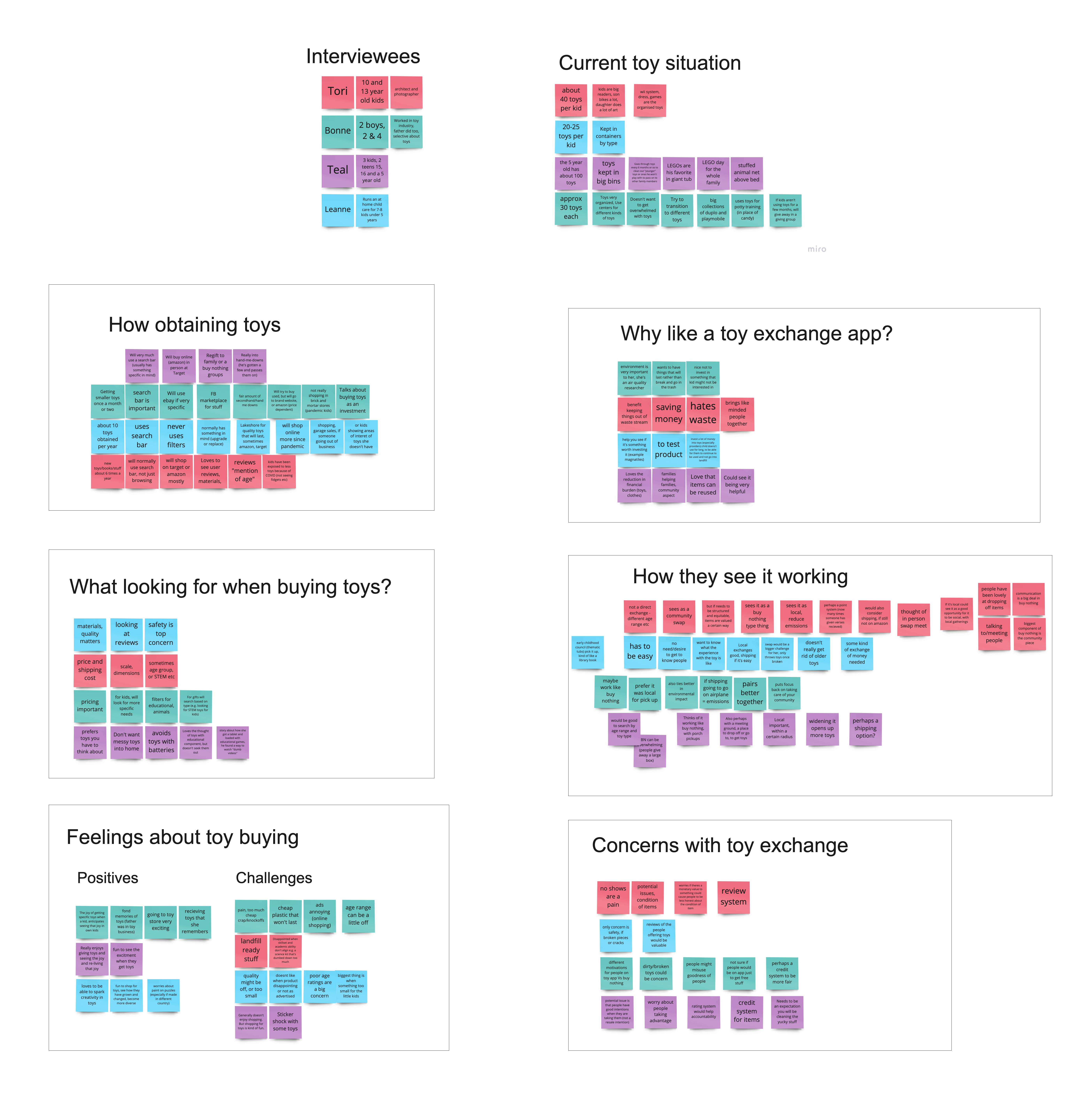
Using empathy mapping to synthesize what I learned, I was able to understand more about what works and what users need/expect when tackling a toy swap app:
What they do now
- Learn where/how users currently obtain toys
- what works/doesn't work when looking online
- their feelings towards that process
App Expectations
- How users anticipate using a toy exchange app
- learn if it's something they would use
- what their ideal use case would be
- learn of any anticipated challenges
All users had fond memories of toys and generally felt positive when looking for toys. Most users explained that price, safety, and quality were top priorities when looking; with cheap "landfill ready" toys being the biggest challenge. When shopping online, all users liked using search bars and some users like to use filters to narrow down the search (in regular stores).
All users said they liked the idea of a toy exchange app. All users felt a direct exchange wouldn't be possible, as they often hand down to younger children after theirs has outgrown items, but they all suggested some kind of token/credit system. validating how other apps manage exchanges. Simple and easy were the biggest priority, as were the idea of keeping exchanges local, both for simplicity and to minimize environmental impact.
Affinity map created from user interviews with 4 people who have children they obtain toys for regularly and who are members of the 'Buy Nothing' community.
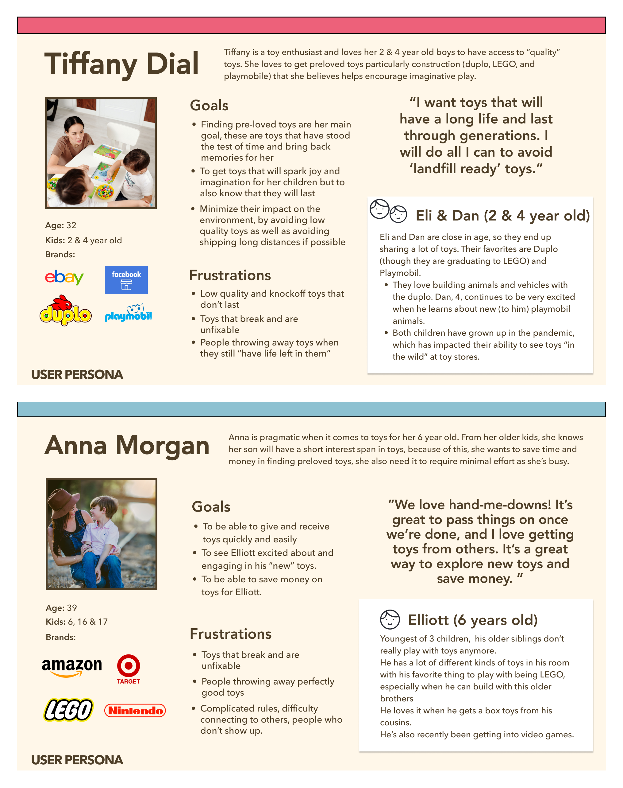
Meet Tiffany, Anna, and their children
Based on user the interviews, I created two adult personas, and their children. Tiffany has two young children and loves high quality pre-loved toys. Her goal is to buy a little 'new' toys as possible to minimize her environmental impact. Anna has one elementary aged kid. Her priority is to save money and to do so fast and easy. She really likes hand-me-downs and loves to pass on her kid's toys when he's outgrown them or no longer plays with them.
Competitive review
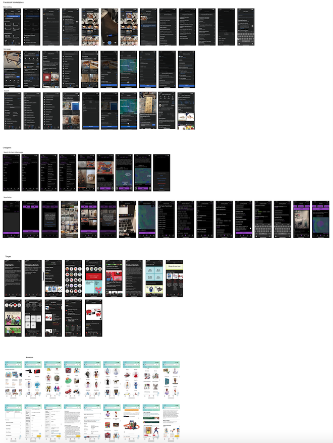
While I had earlier analyzed a selection of toy exchange apps, they did not have strong user flows so I decided to review the listing and search flows in Craigslist and Facebook Marketplace to identify design patterns and flows. I chose these apps as they were popular "classified" tools that users mentioned in my initial interviews.
I also opted to review Amazon and Target product pages, toy categories, and age ranges; I chose these apps because they were the online options that were brought up in the interviews.
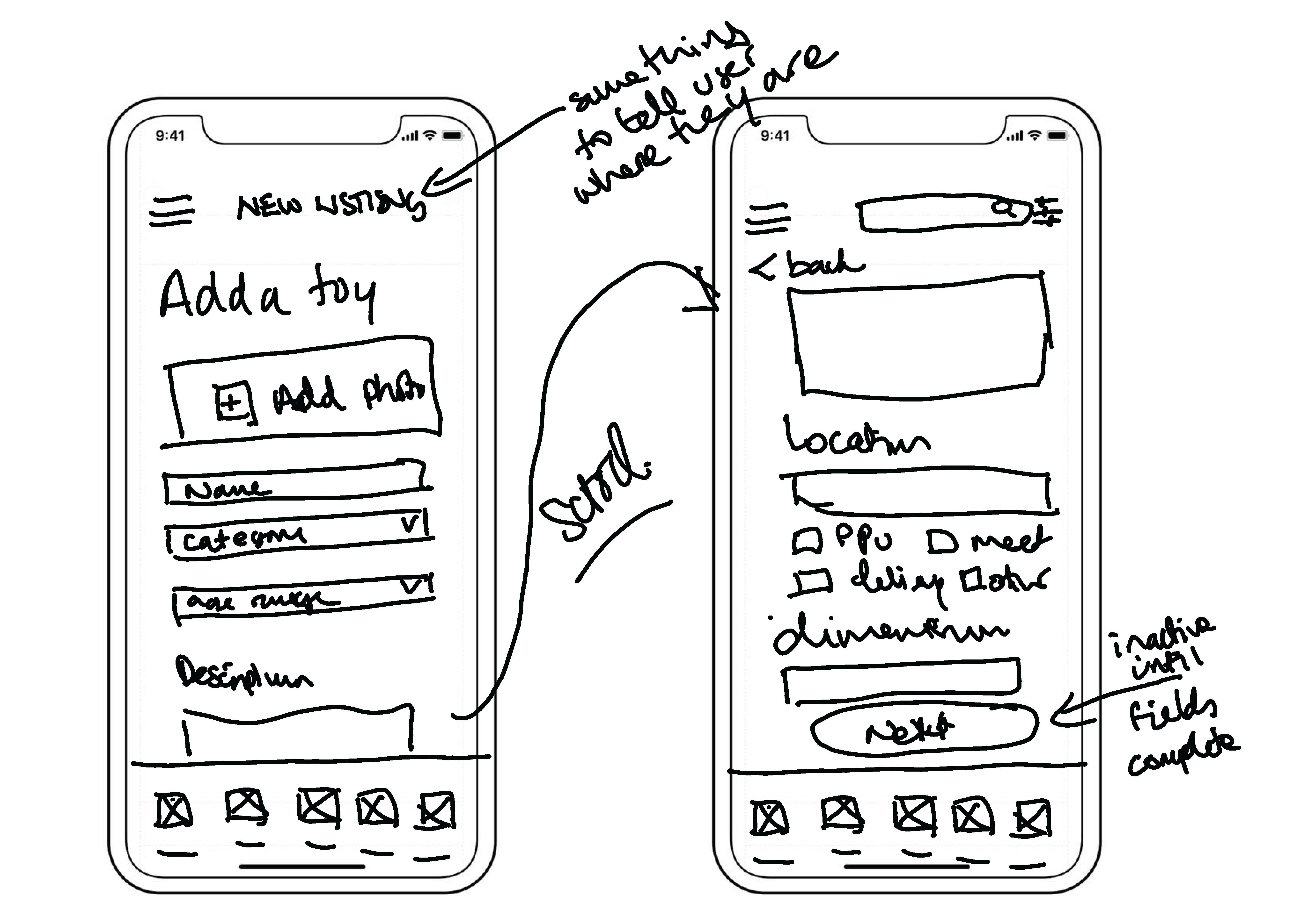
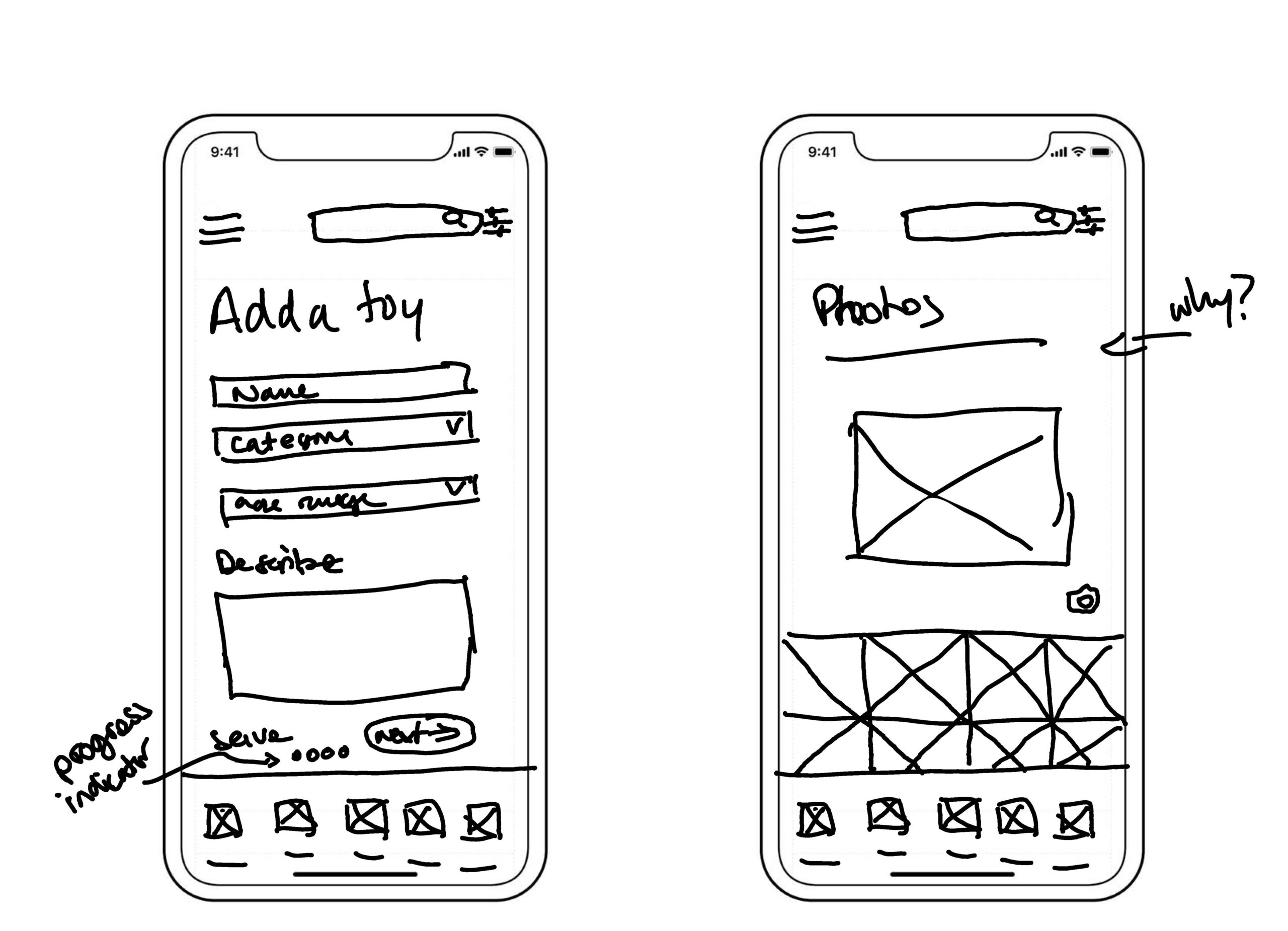
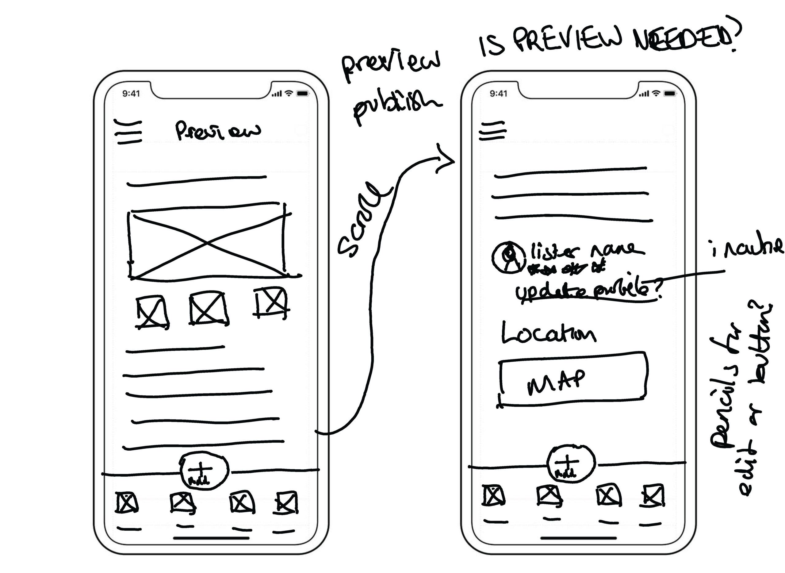
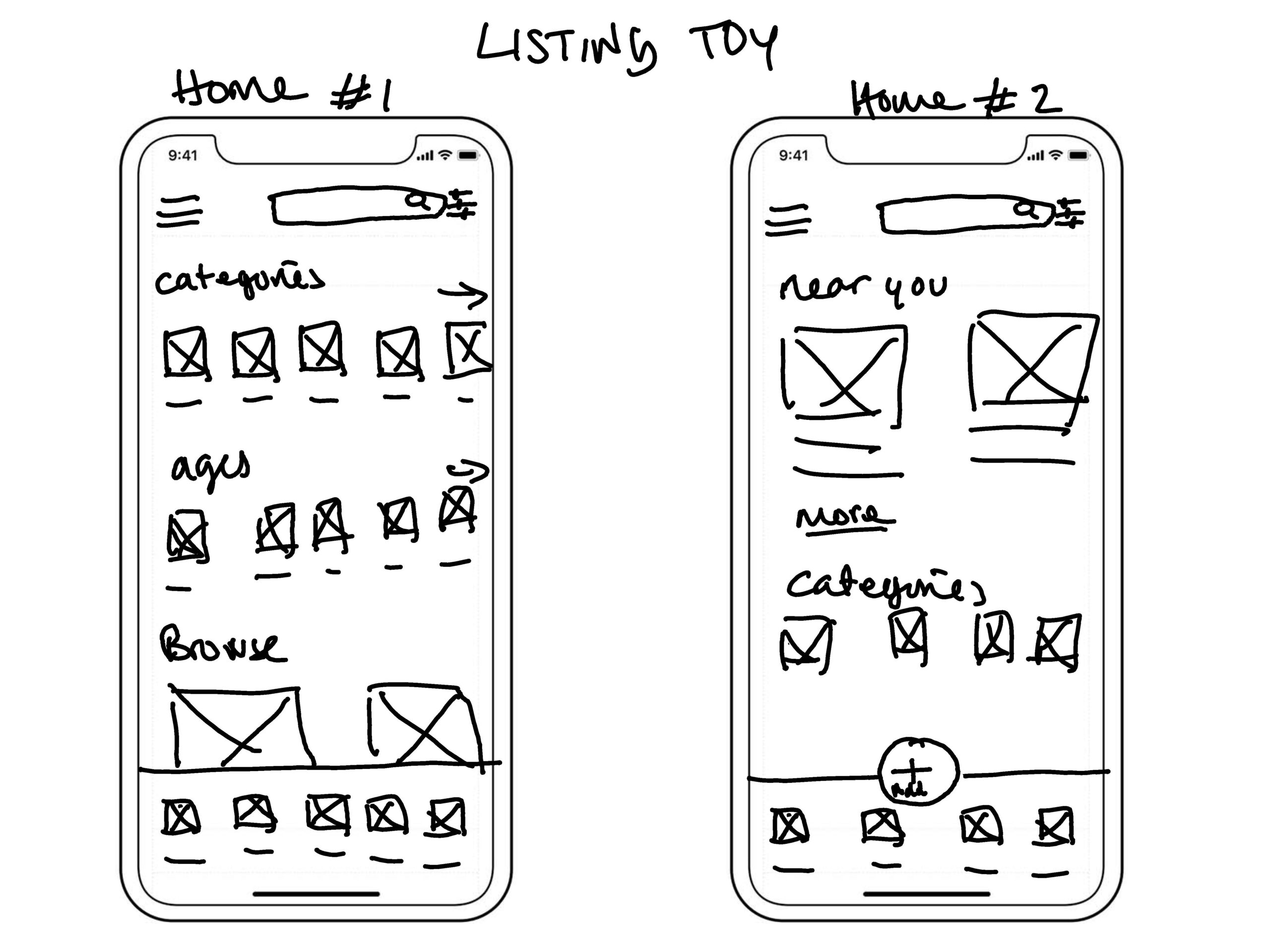
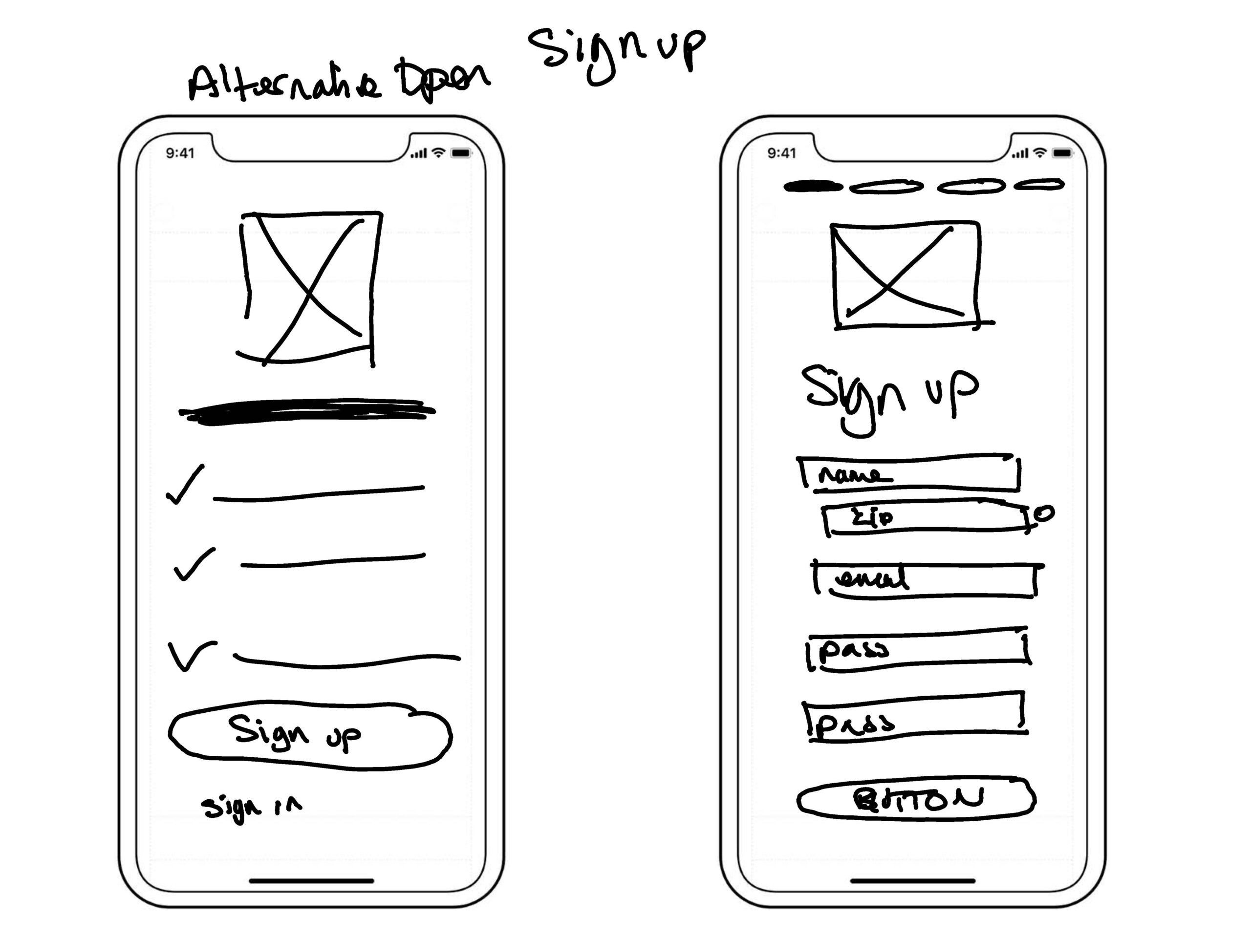
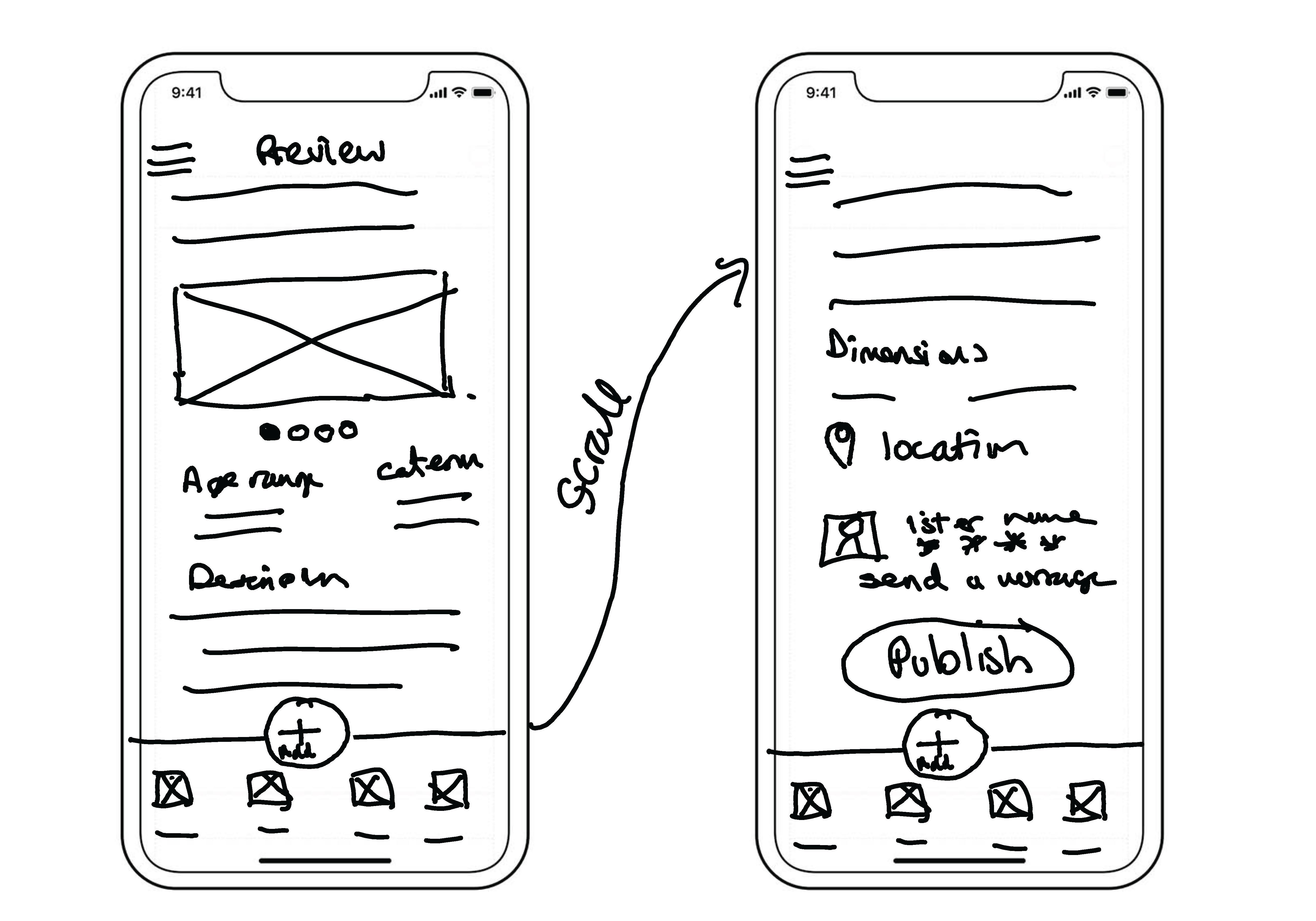
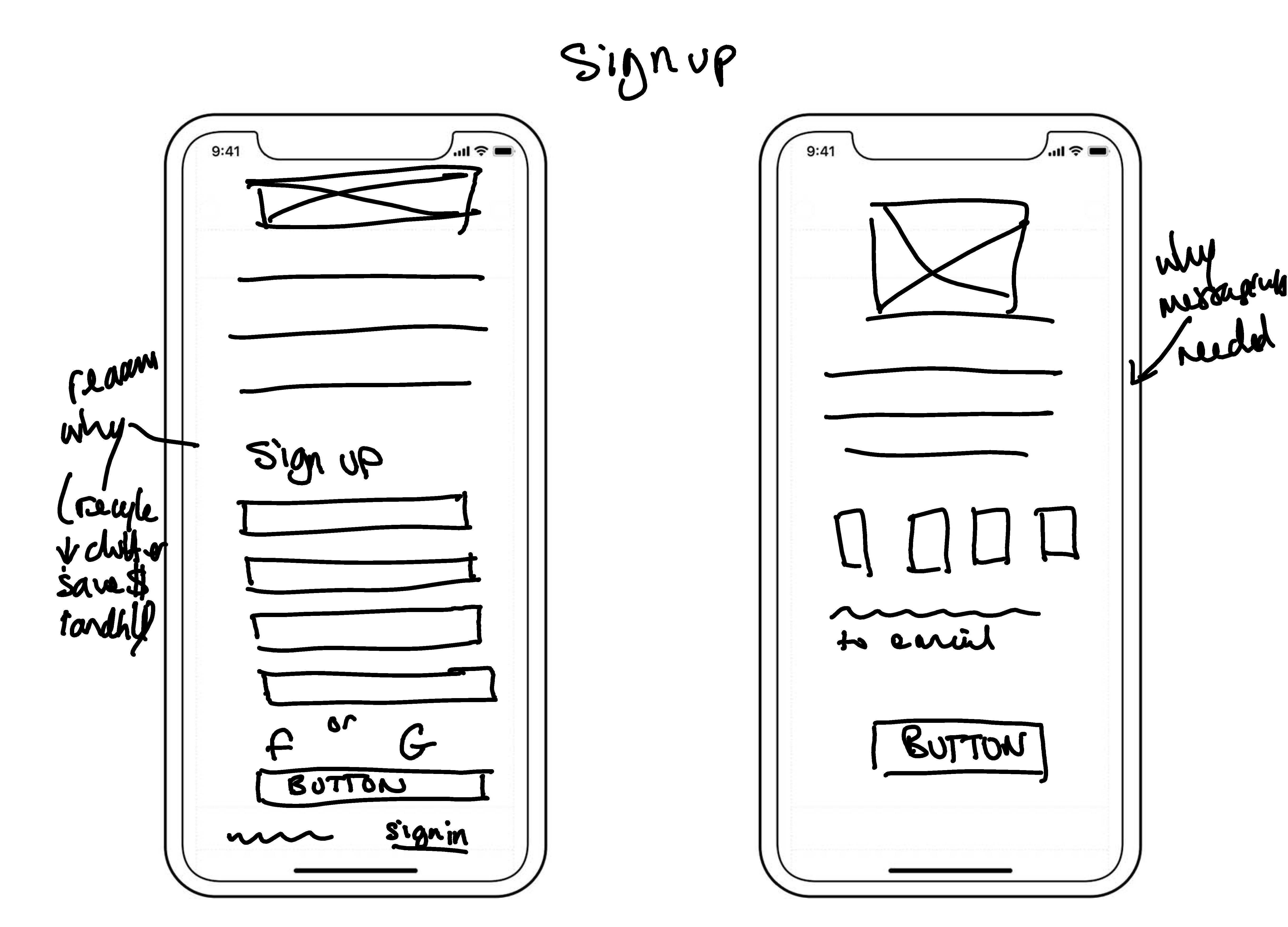
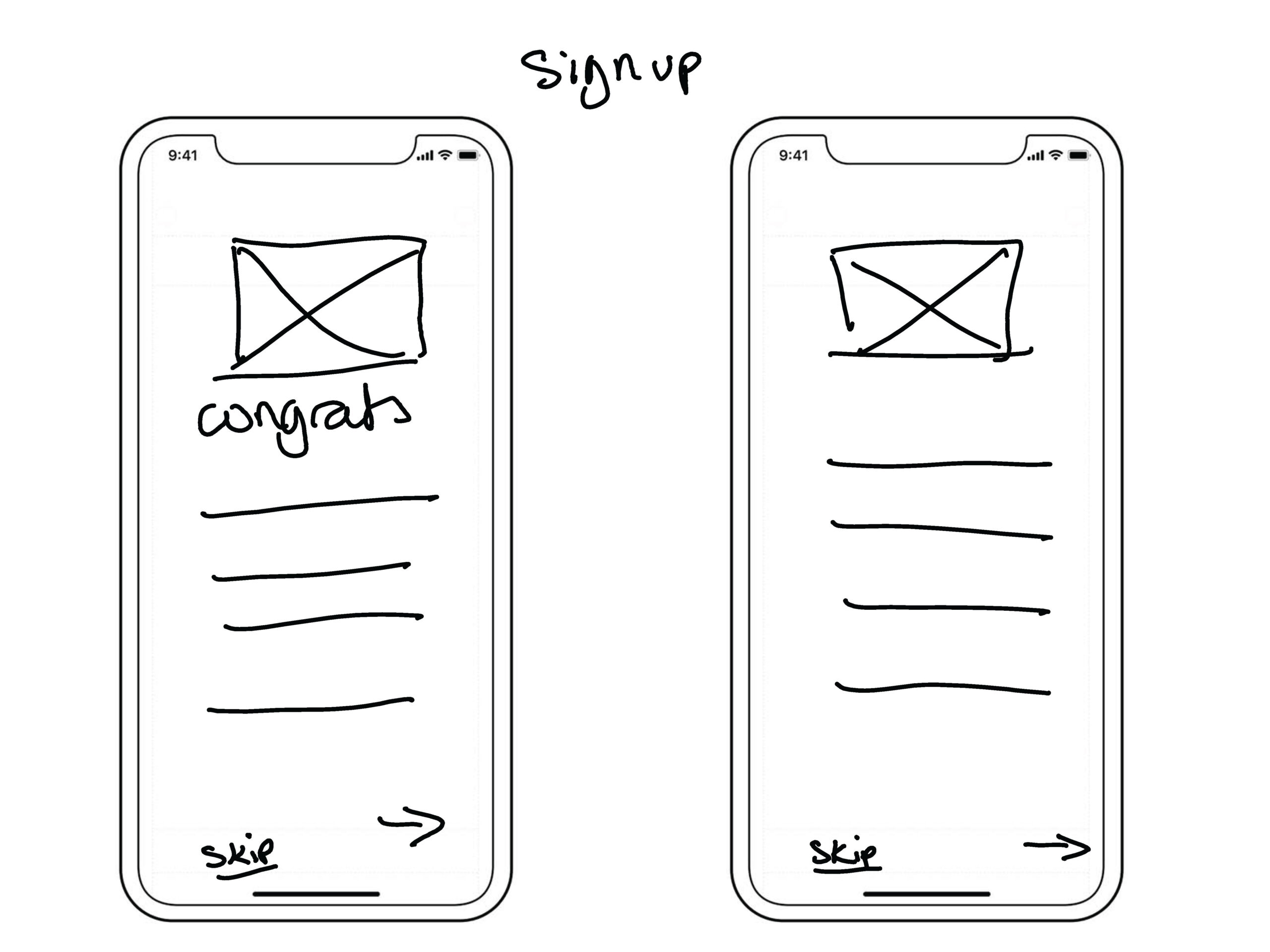
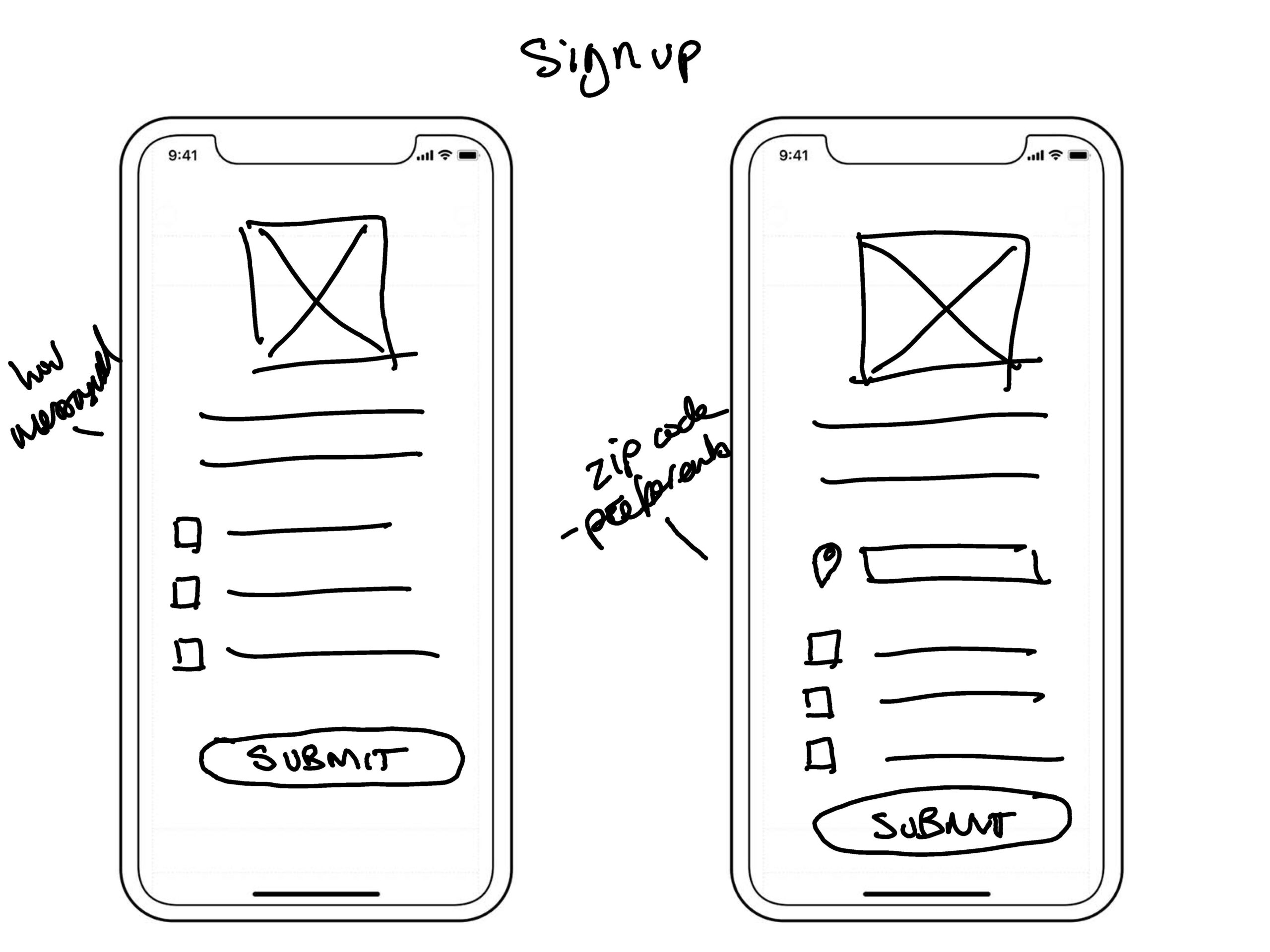
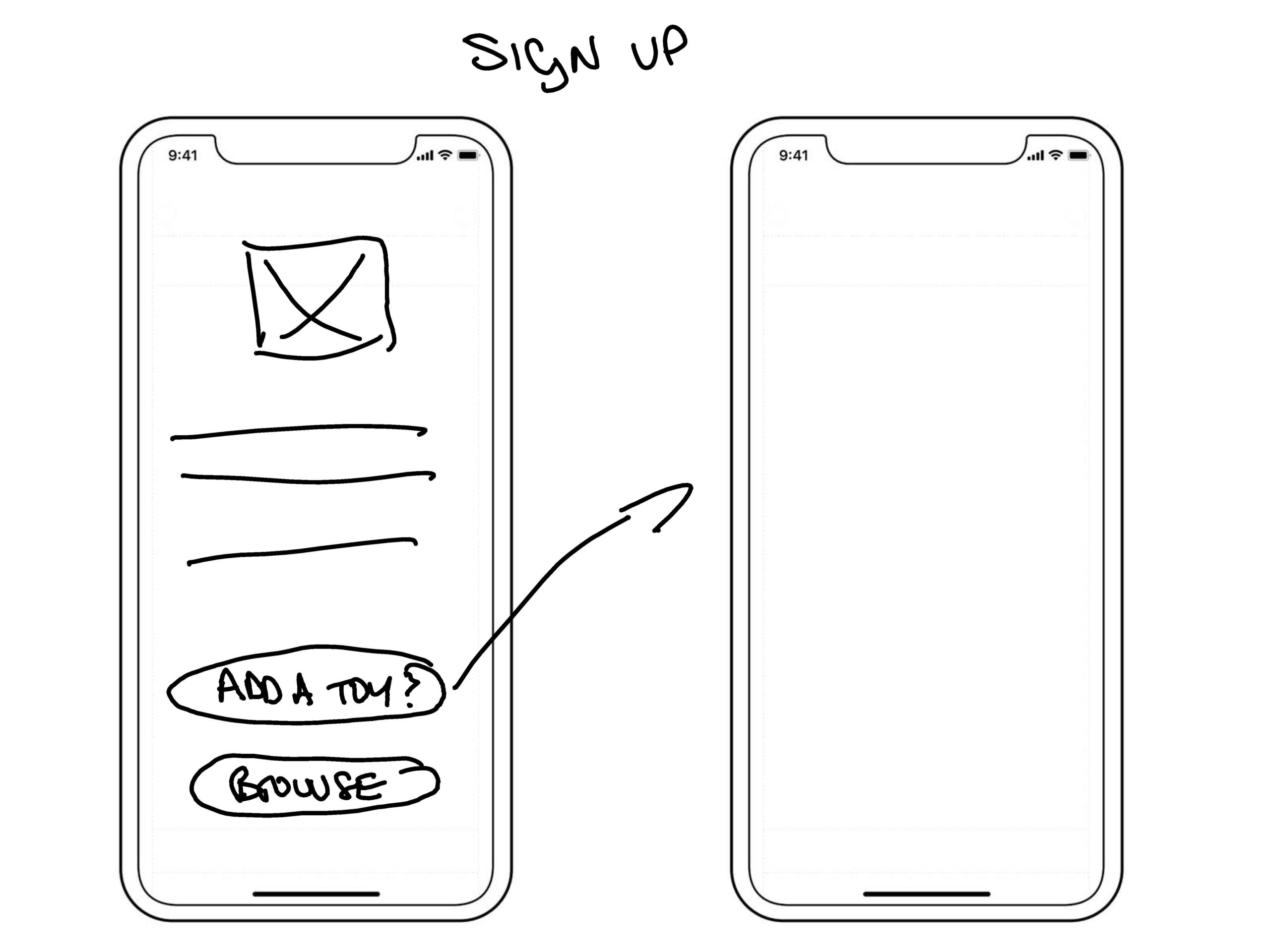
Sketching out ideas
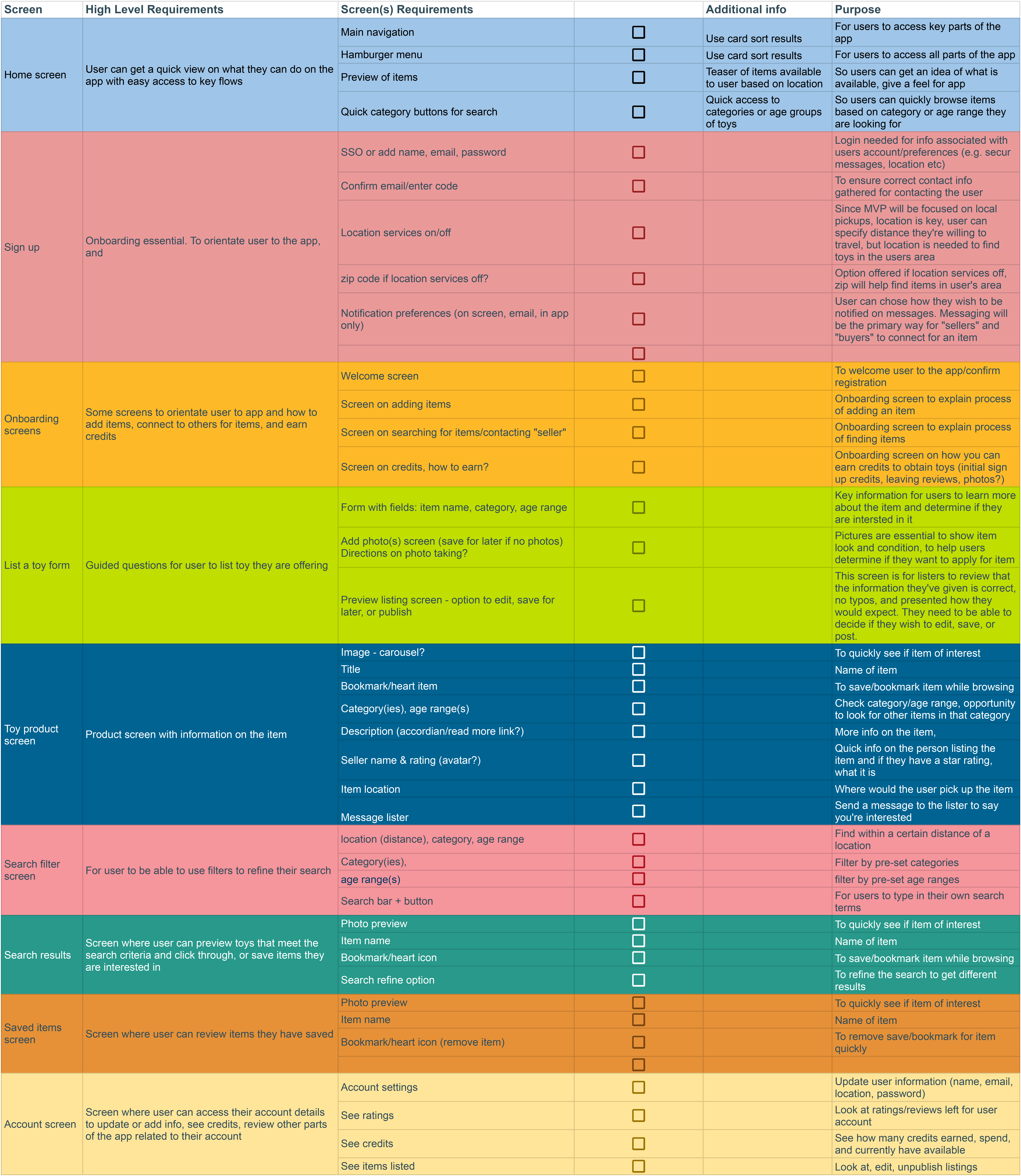
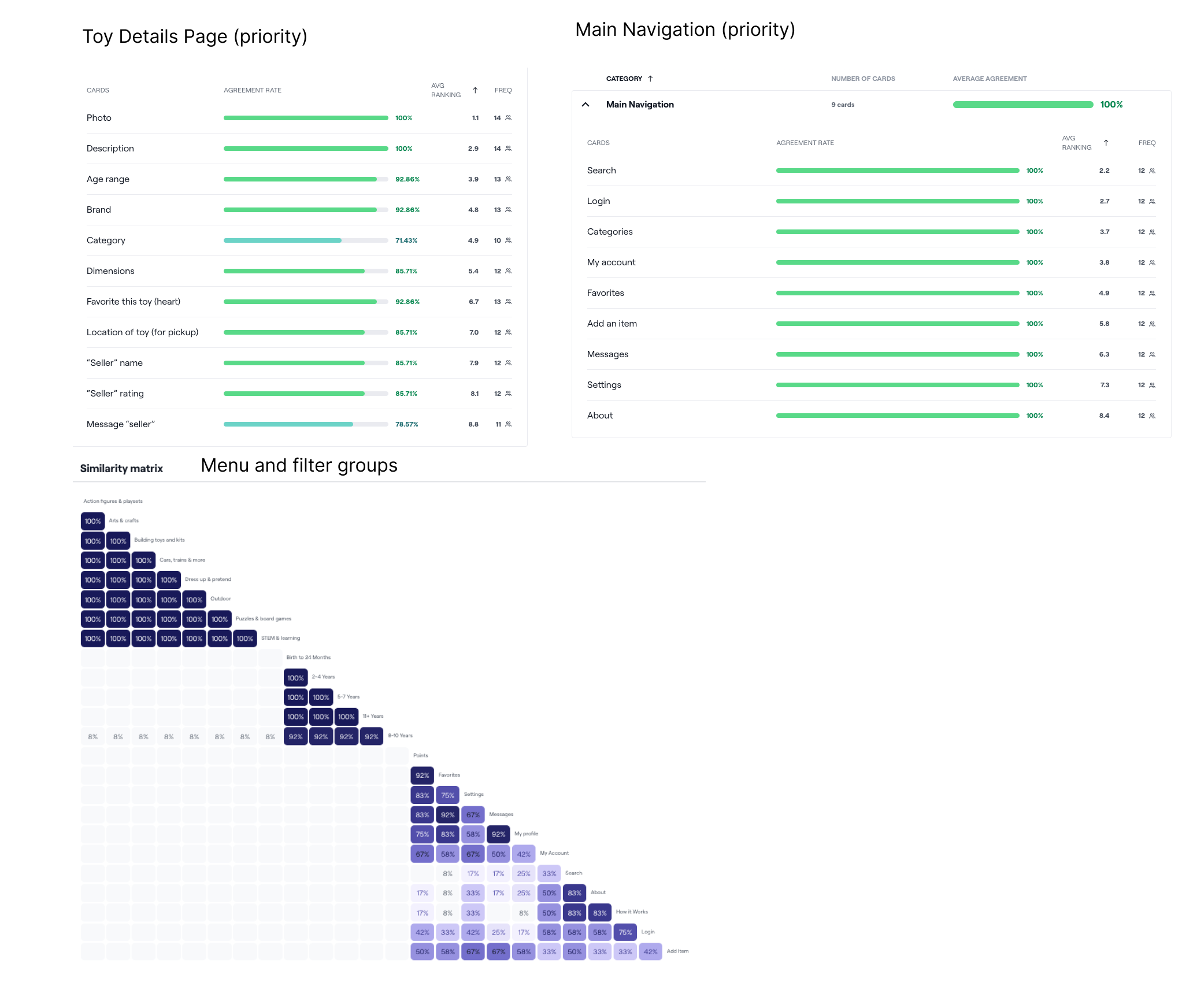
Now that the product requirements and flows, I started sketching to quickly generate ideas for screens and flows.
Wireframing
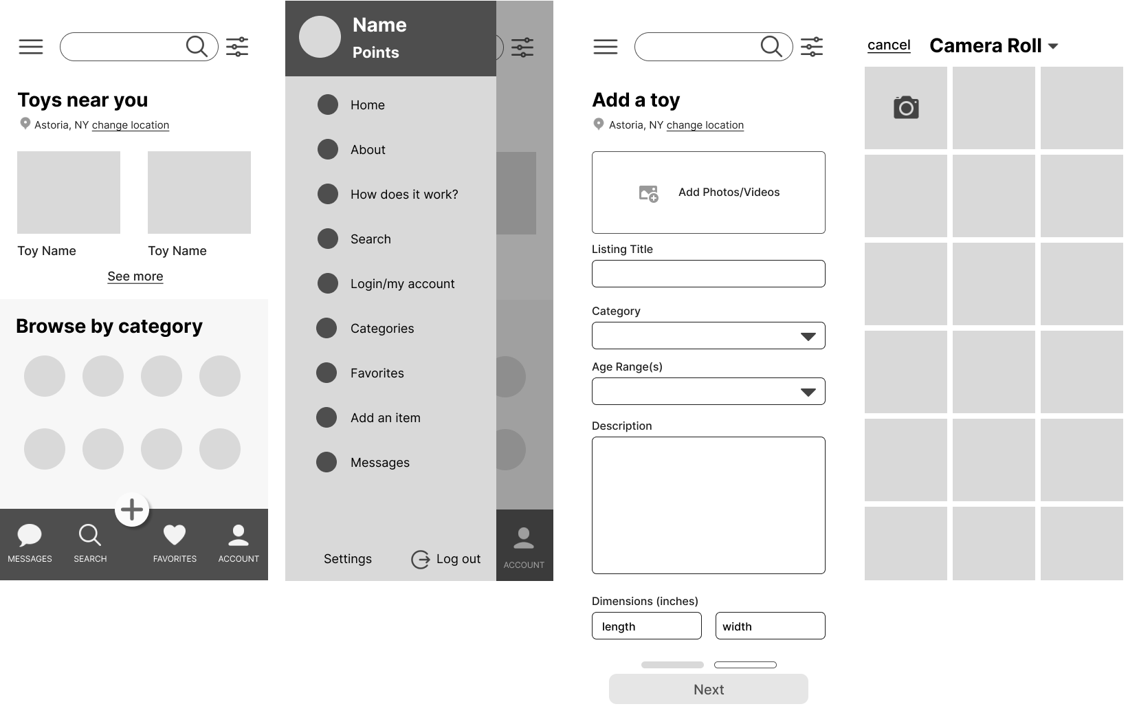
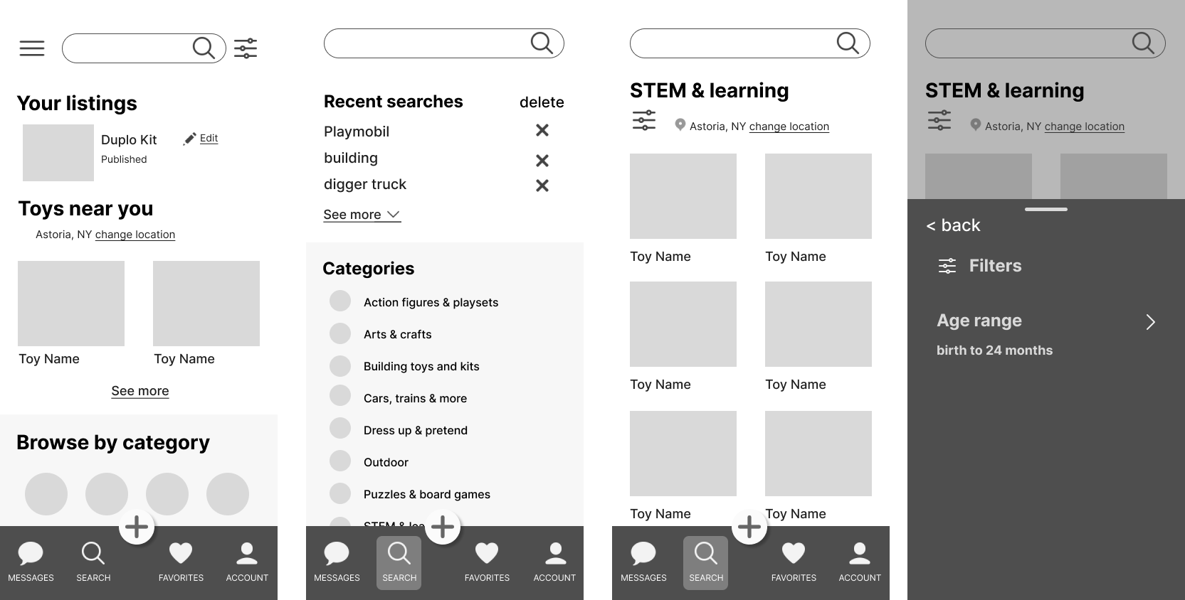
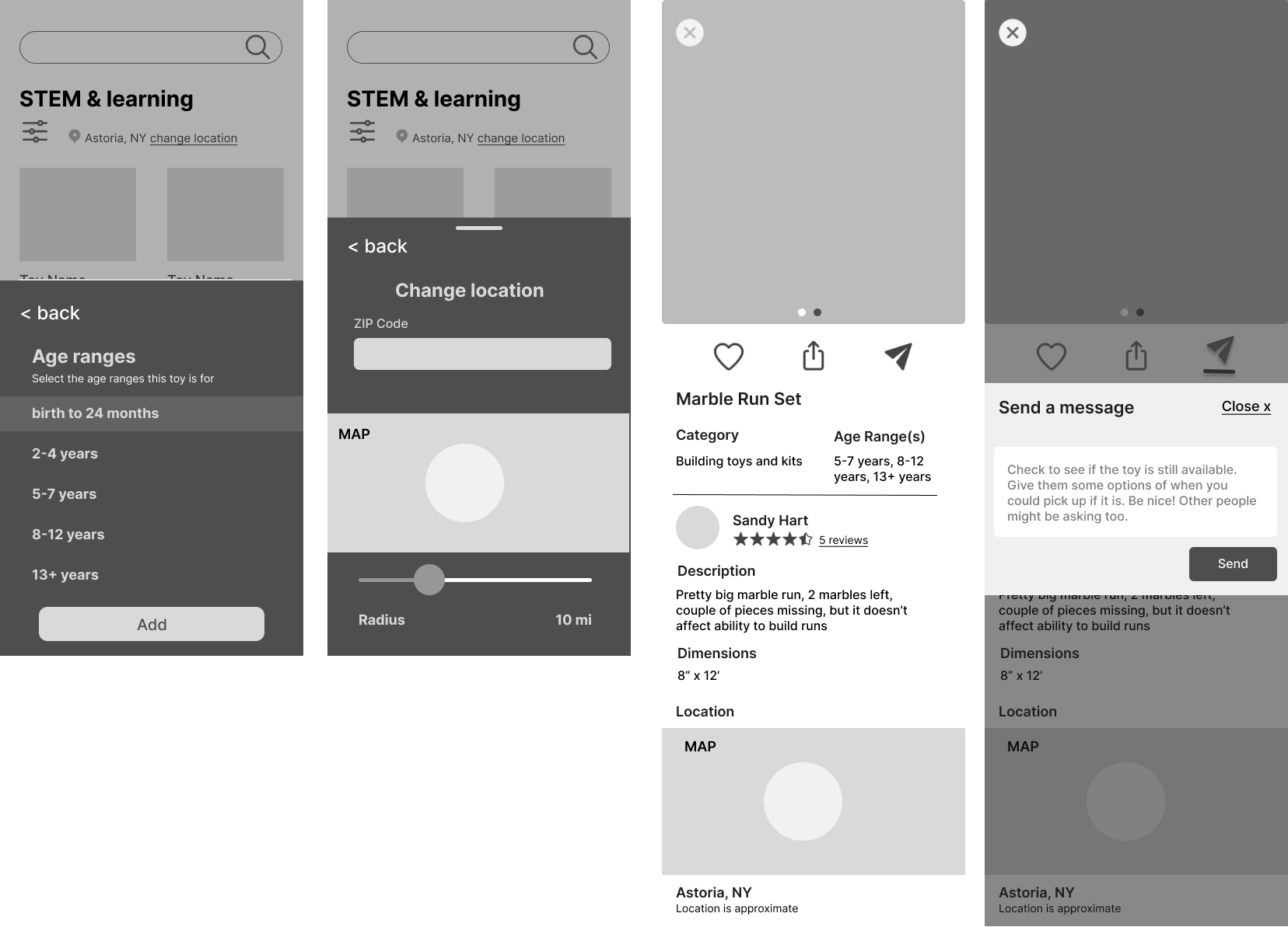
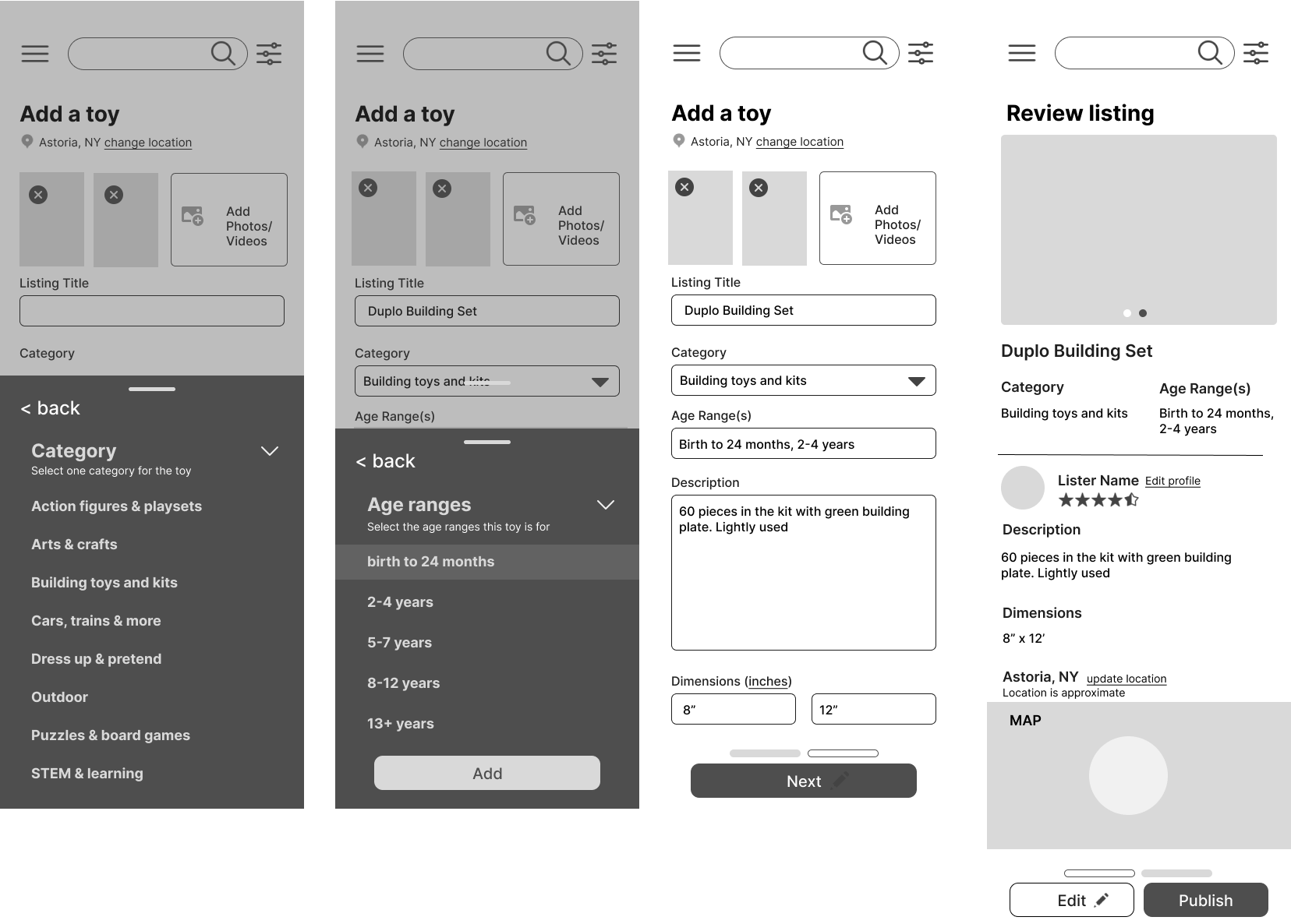
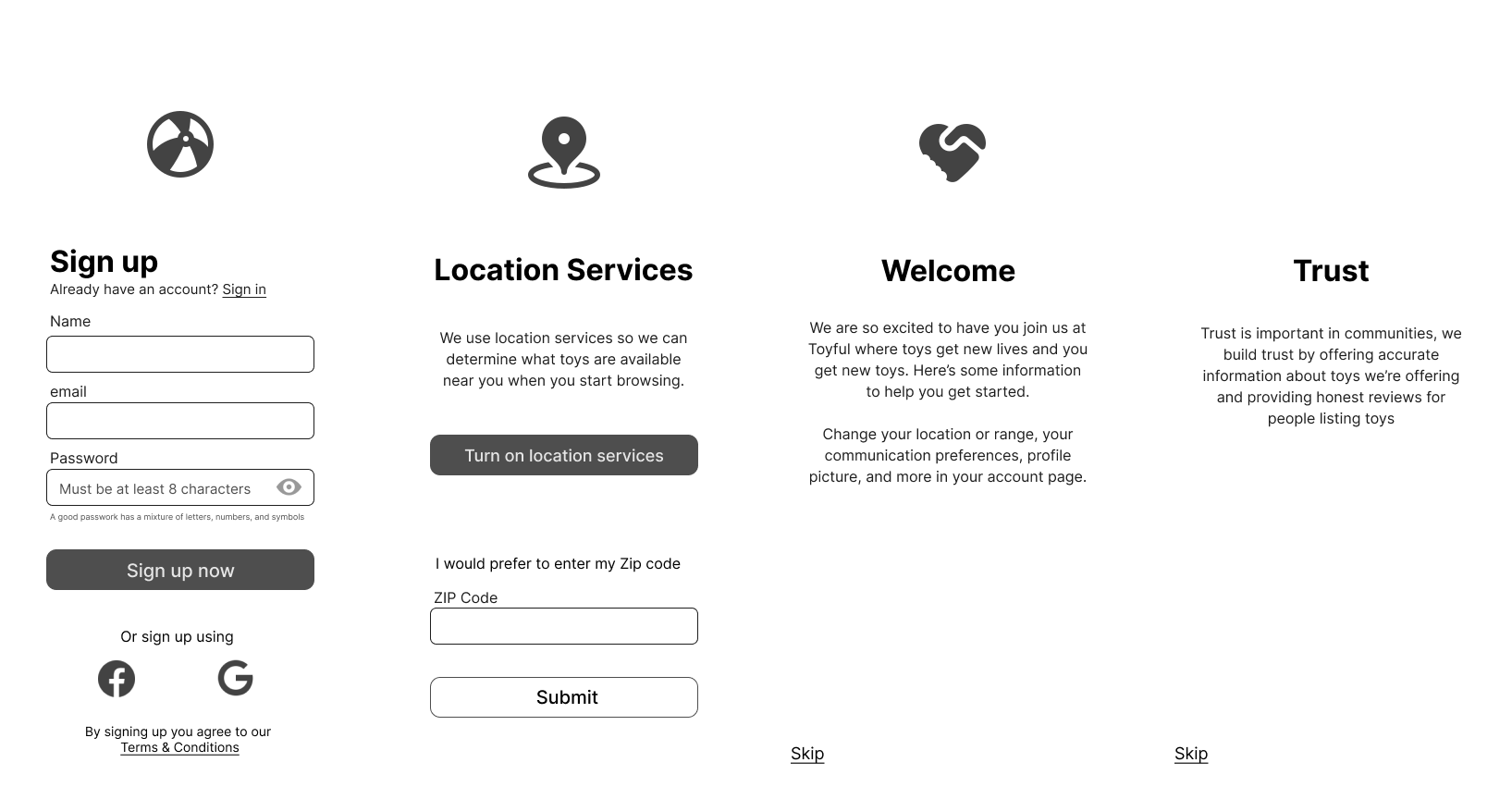
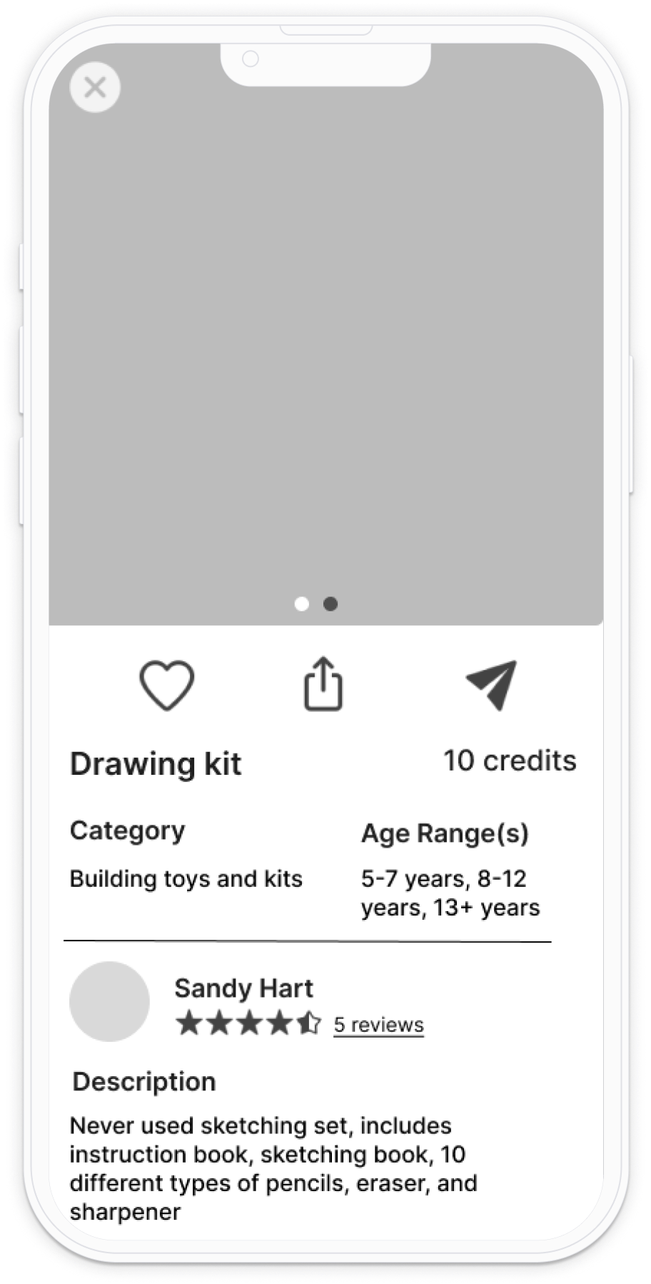
Using the sketches to guide me, I created mid-fidelity wireframes to use for prototype testing, since this was a new product it was important to test the flows first before building out a high fidelity design.
Prototype Testing
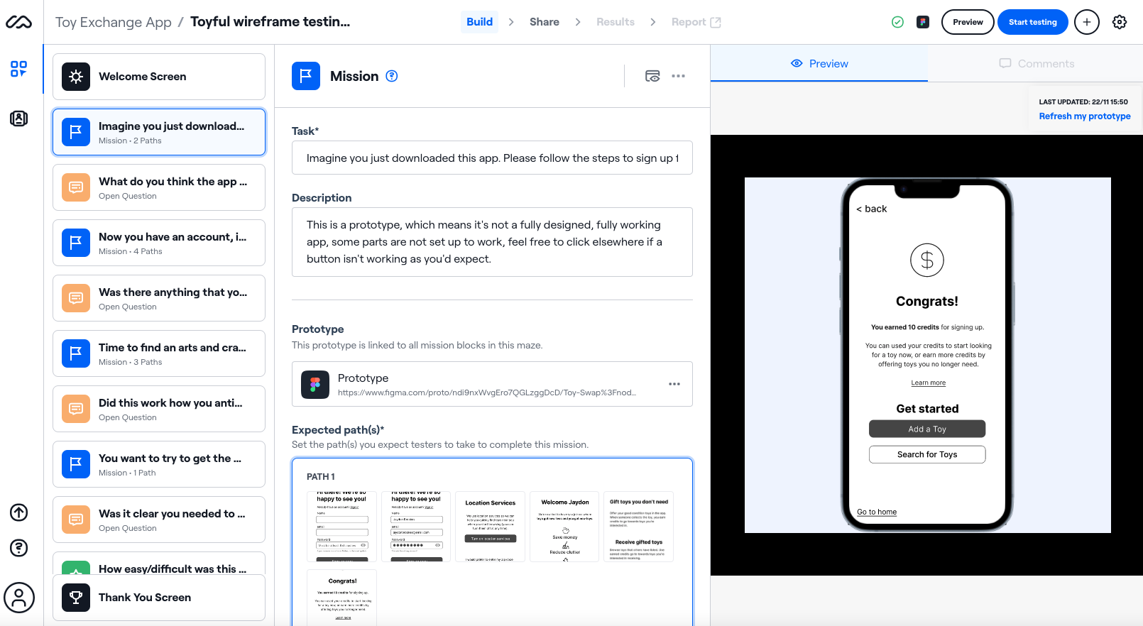
Using the wireframes, I created a mid-fidelity prototype to test in Maze to evaluate the 3 key flows — broken down into 4 tasks with follow up questions. My goals were to:
- check that users understood what the product was
- learn if the flows were effortless and intuitive
- identify any points of friction/places for improvement
- learn any additional expectations from users, both within the flow and beyond
Preview of the Maze test in which 24 users participated in.
Key takeaways
Onboarding
The onboarding screens gave clear information to users about what the product was for and how they might use it.

Having the onboarding really helps to explain what the app offers. I'm not sure if there is more information I want yet.
Overall the app was relatively easy to use
Testers rated the app 7.6 in ease of use (with 10 being easiest)

It was very easy to navigate. I'm not really sure what would make the experience better as I did not encounter any challenges while using it.
The search flows were confusing in parts
Some users felt they needed more support, particularly when it came to using the filters in the search and messaging about the toy.

Needed more support with actually how to do things, wasn’t intuitive what I should do.

I think I got confused with finding the filters for age. I think I just clicked on a bunch of things until I found the correct filter for age. The location filter was pretty easy to do.
Messaging confusion
The most confusing part was that users couldn't clearly see the next step would be to message the person listing the item. This could be the icon, the placement or the lack of support for this feature.

It wasn't immediately obvious that I needed to send a message.
Iterate to Improve
User testing helped me change and improve the usability of the app. Feel free to explore the prototype. You can read more about some of the iterations I made below.
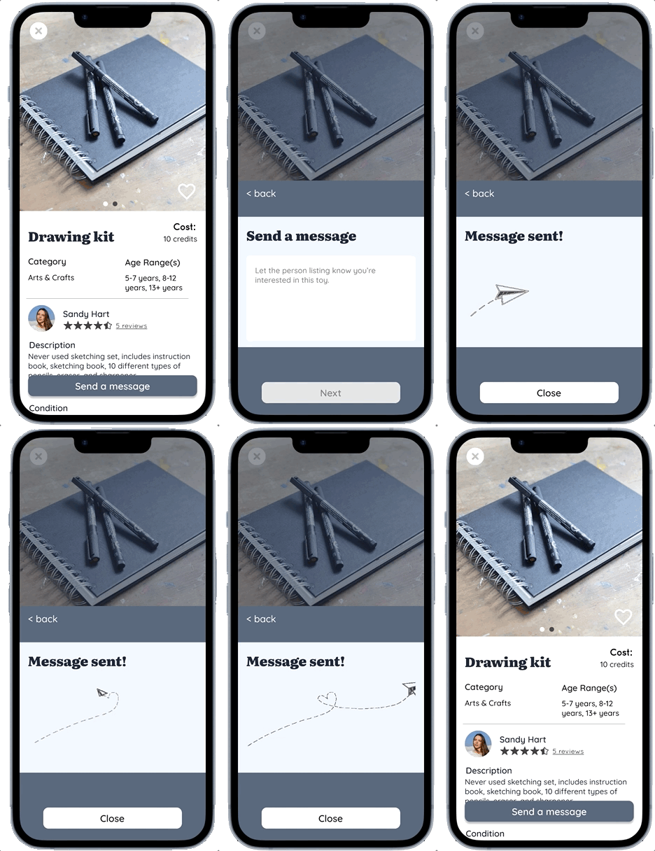
Sending a message
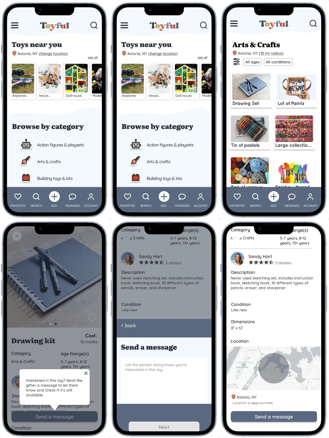
People need to send a message to ask about and obtain a toy they're interested in. Any confusion on how or where to to this would be a huge failure for the app, so changing the message design on the listing screen was a priority. To help users more quickly/easily identify how to follow up on a toy I:
- Added a fixed "message" button to the bottom of the screen that would be visible at all times.
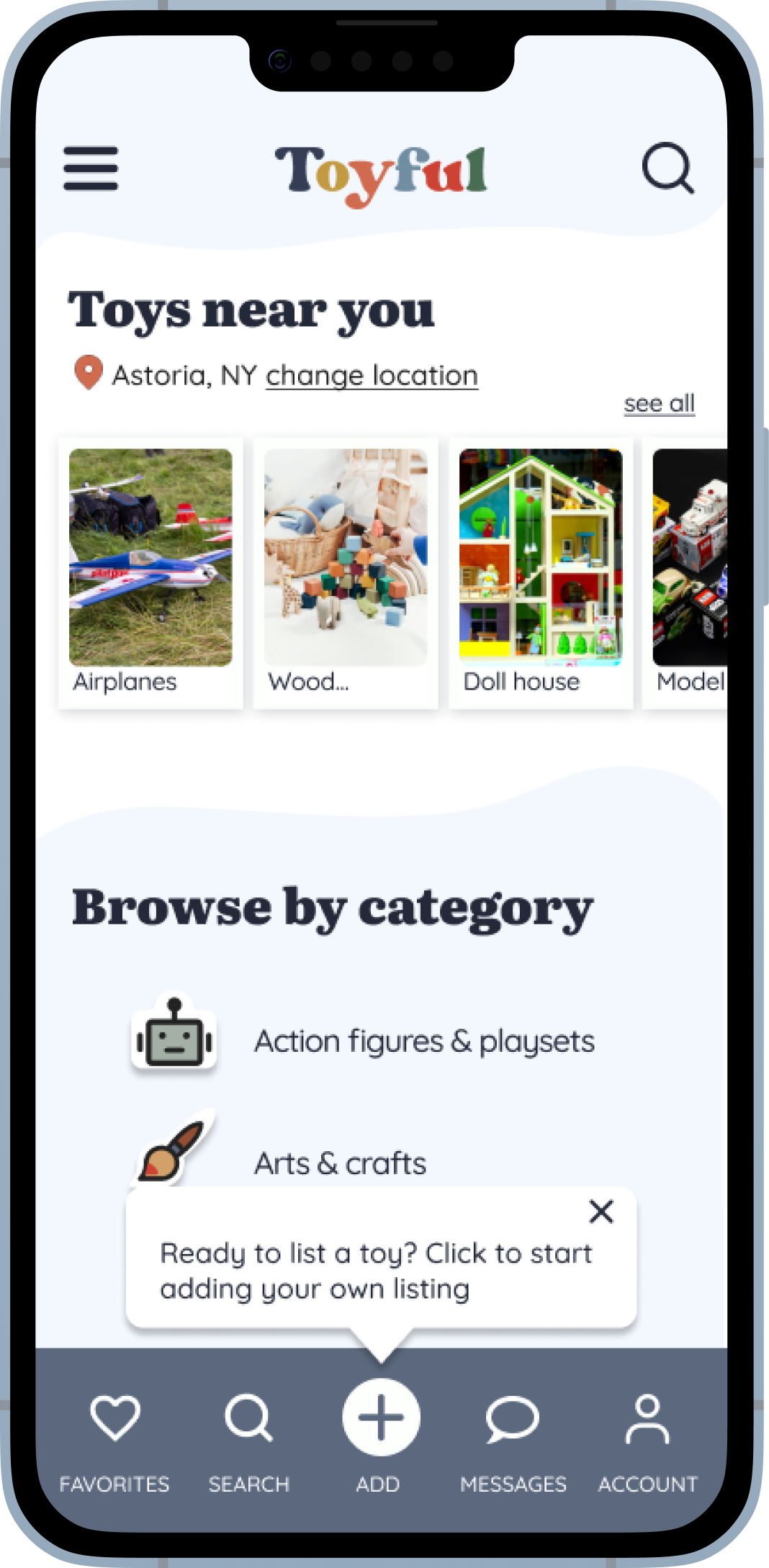
- Added an onboarding tooltip directing users to the button and what to do.
"It took me a bit to find the "add a toy" option"
Several users stated that it took them a moment to find the add a toy option. It may have something to do with the flat prototype, however, I suspected some design changes would improve usability.
Solutions
- Moved the add button alongside the other menu items so I could add a label like the others.
- Added a tooltip for first time users to help point users to the button.
Was my item even listed?
Several users said they weren't sure if they completed the "add a toy" task as there was no confirmation on screen.
Solution
I added a confirmation popup message so users get visual confirmation that their toy was listed.
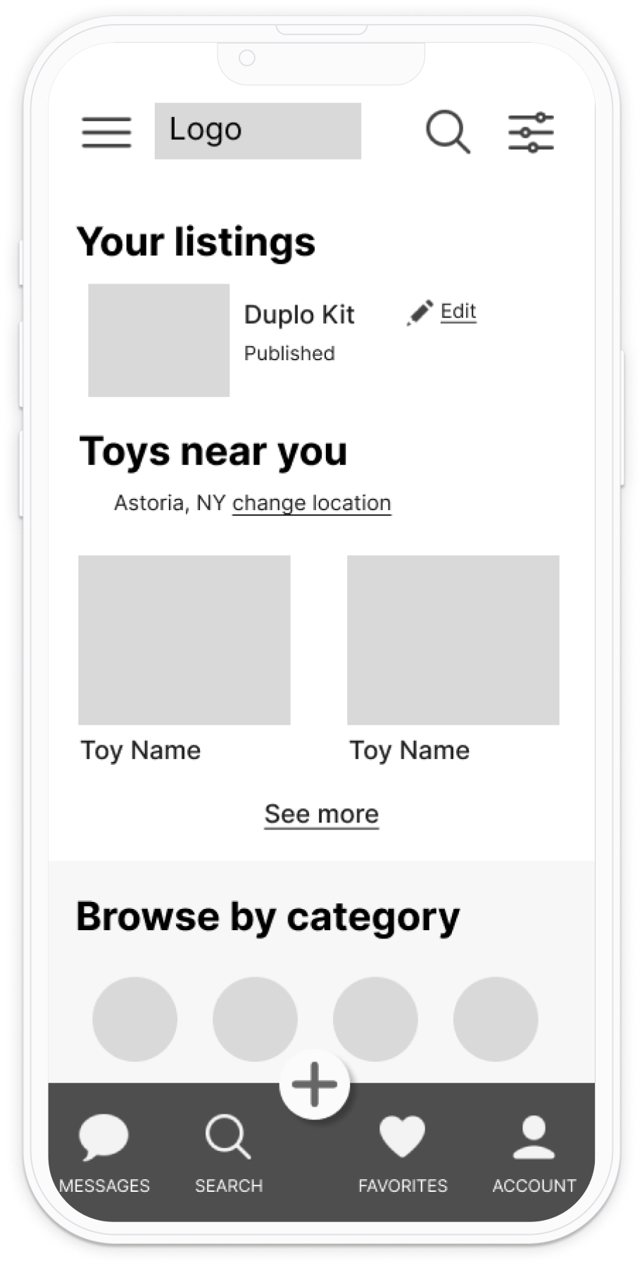
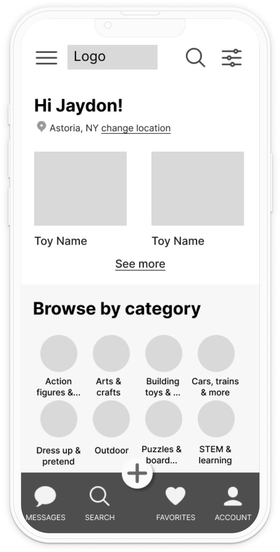
Mid-fidelity prototype screen with the listing being shown on the home page
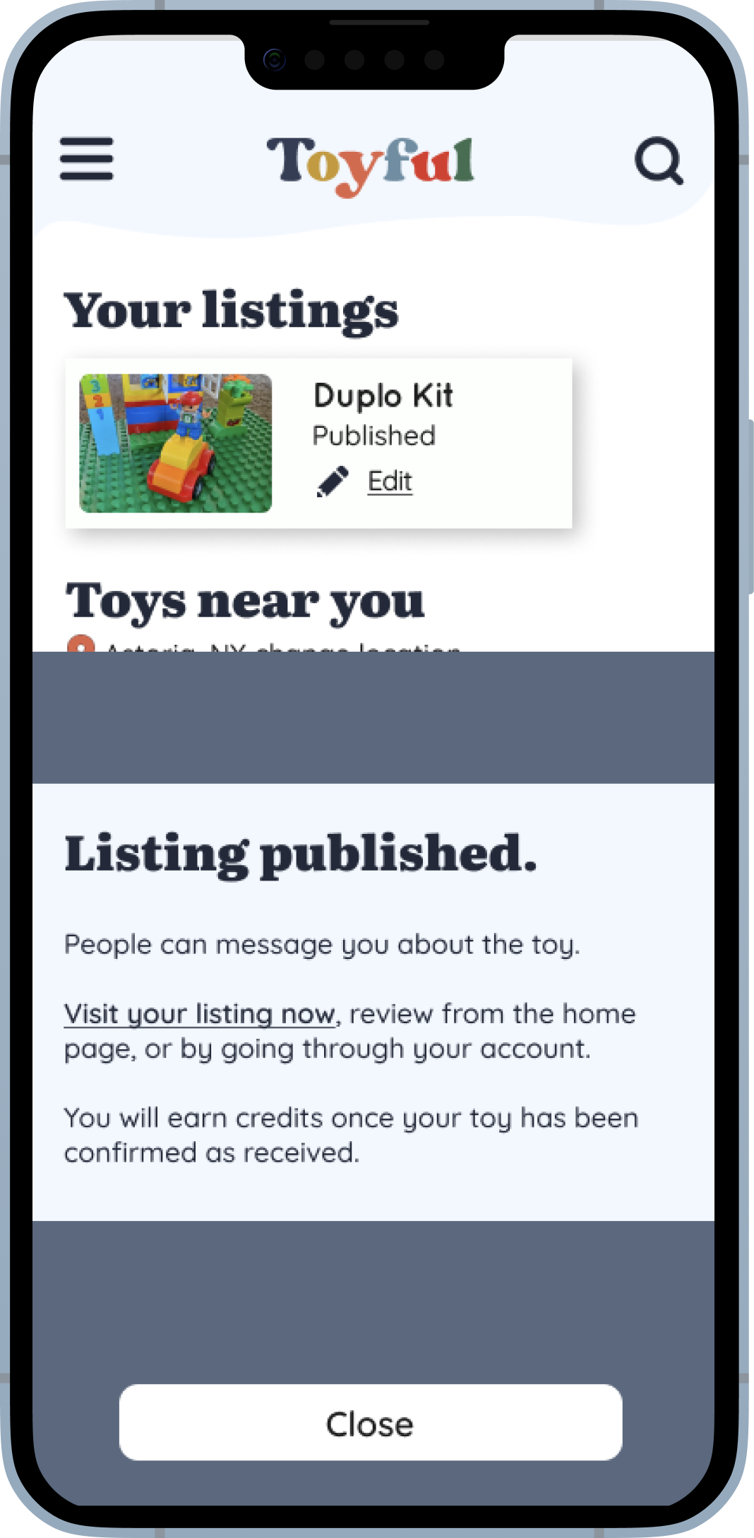
High fidelity iteration of the home screen with confirmation message that the toy was published
Where are you?
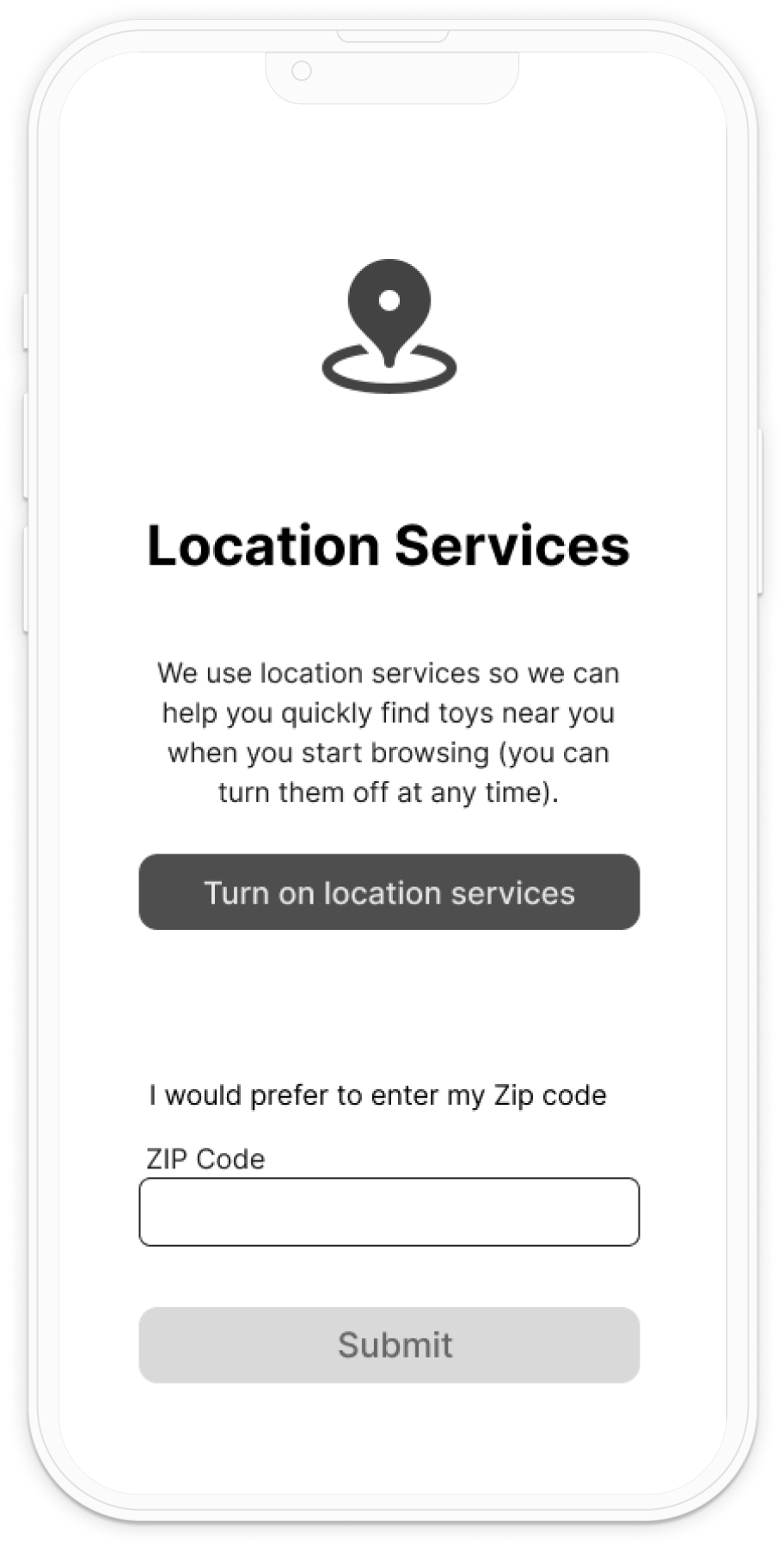
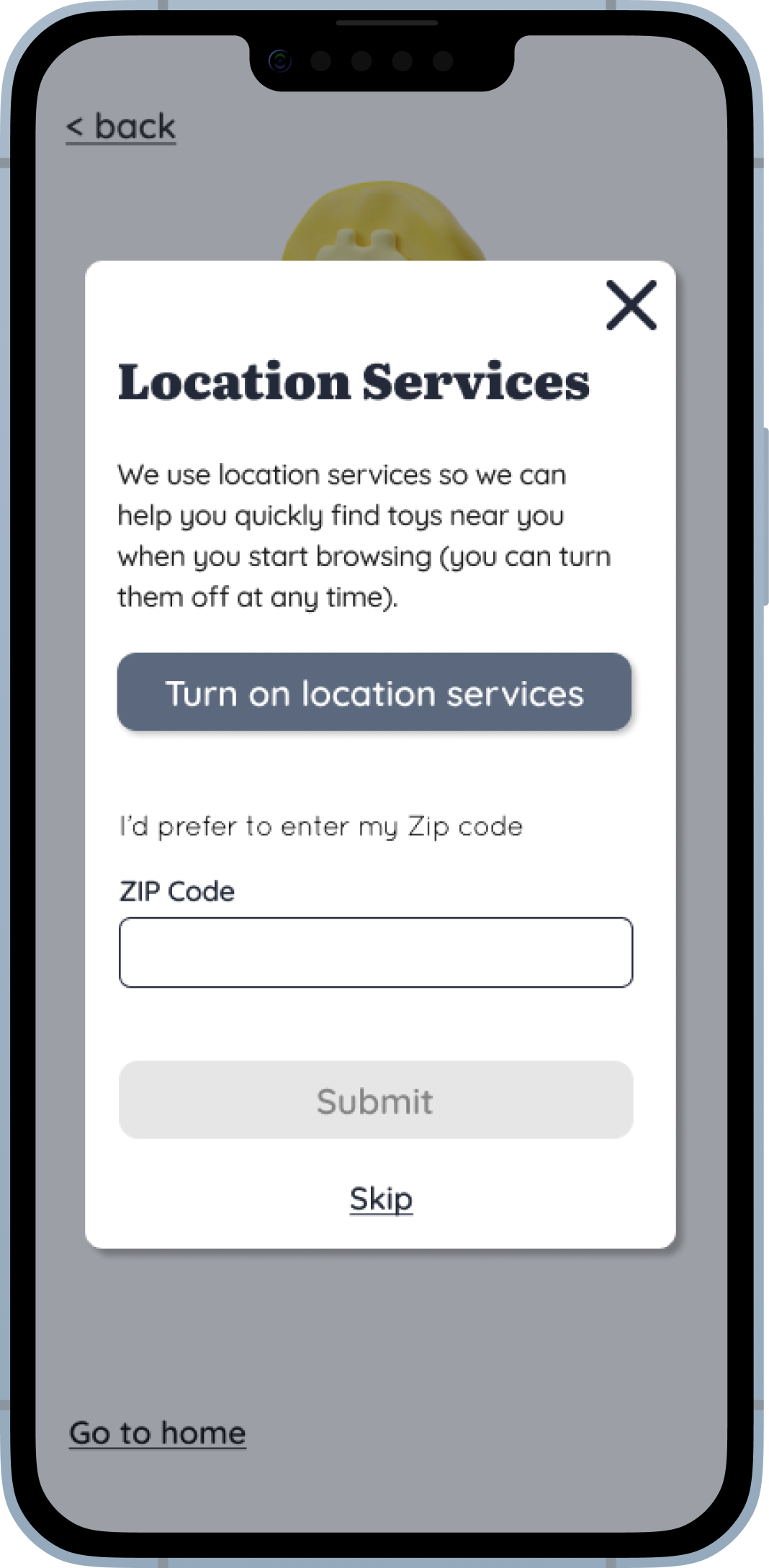
I observed a high drop off rate on the location screen during prototype testing.
Solution
Location impacts where you can find and gift toys, however this is also information the user can add later when searching for or adding a toy, so I opted to move the location services to later in onboarding and have it be a pop up. This still provides users with an explanation as to why location is needed, but also offers the user a more obvious “out” if they are not interested in adding their location at this point.
Next steps
Some of the iterations involved pretty significant changes that will impact the flow, I think it would be prudent to re-test these flows before handing off to developers. My next steps will be to:
- Create screens for account, manage listings, and message management.
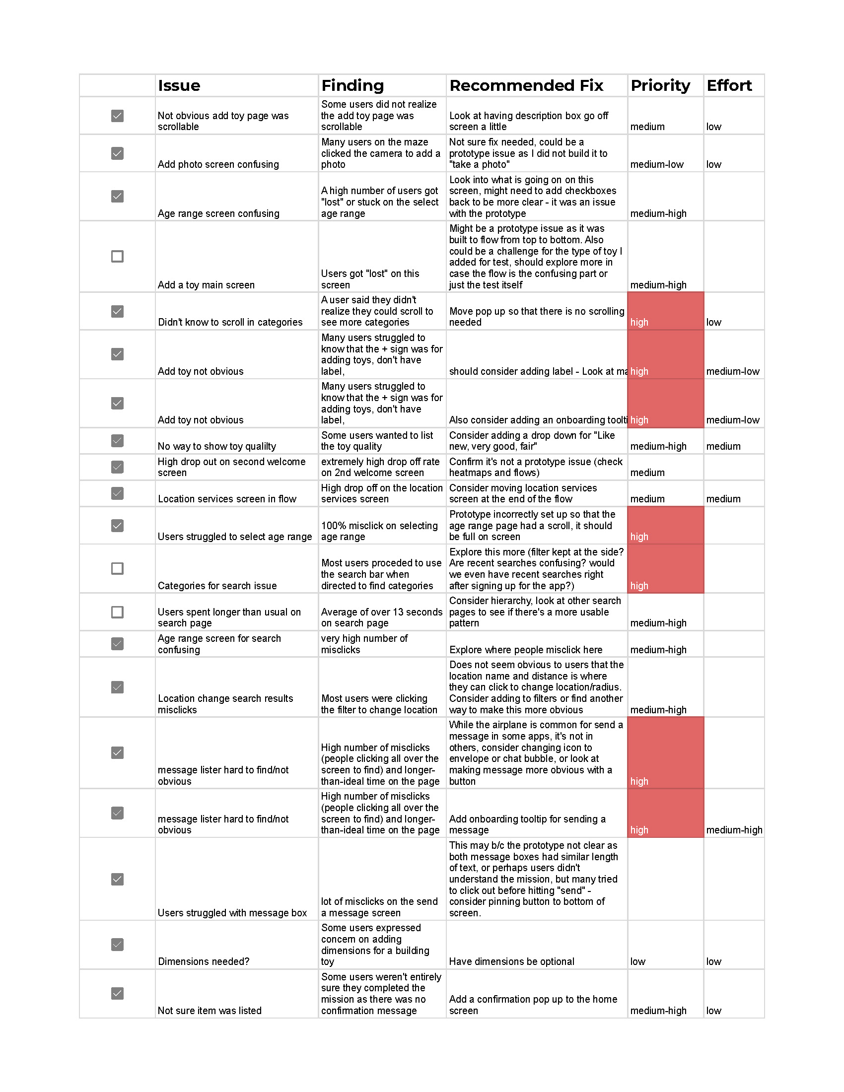
- Add items left in the the priority revisions matrix to the backlog list for post-launch.
- Investigate ways to show users how many credits they have available when they are on the listing page.
- Further explore the credit system with users to understand if a "one size fits" all approach, or a "credit tier" system would be prefered when assessing value/cost of gifted toys.
- Explore adding a feedback option for users to share ideas, tweaks or concerns.

